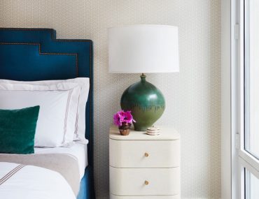
Last week I shared a peek at the living space in an alcove studio model apartment I designed recently and now I’m excited to share a peek into the bedroom. Whenever I’m designing any space, I love to layer on the texture and pattern. Here, I kept the space neutral because it was a model apartment and needed to have a wide appeal but with the addition of a few key elements such as the geometric patterned wallpaper, boldly colored bed and a statement lamp, the space feels colorful and packed with personality. The textures were very important here as …
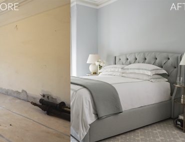
I always feel that bedrooms should be calming and serene and in the case of my #projectparkslope clients who have two small kids, I wanted to create a master bedroom that felt like a retreat from toddler central. The space has a beautiful white marble fireplace which inspired a very soft color scheme. The clients lived in an all gray apartment previously and were nervous about the idea of incorporating color into their home. Since they loved grays, I came up with this soothing blue monochromatic palette grounded in Benjamin Moore’s Cool Breeze which, depending on the light, sometimes can …
Since the full house tour of my apartment was recently revealed on Apartment Therapy I thought you might like to see some before and afters of my space. I’ll start with the bedroom and show you how I transformed it from a boxy, soul-less space into an inviting and elegant retreat.
This is what the bedroom looked like when I moved in three years ago. It had zero character and was also quite small at approximately 11 1/2′ x 12′ with just one modestly sized closet. Aside from creating an elegant sleeping room, I also needed to design a layout …
Since I started my blog I’ve become the resident decorating expert among my friends and I’m often called on for advice. My friend Kim recently moved into a fabulous loft in Soho and asked me to help her with ideas for her bedroom, which she wants to decorate on a budget. Below is an inspiration board along with some ideas I put together for her.
Kim’s loft is a rental with ridiculously high ceilings so painting her bedroom would be too costly and isn’t an option she wants to consider. I recommended a black and white scheme with pops of…Lately I’ve been loving the look of simple four poster canopied beds. Perhaps it was this photo from an old issue of Domino that first ignited my canopy love…
This steel campaign style canopy bed was featured in one of my favorite rooms designed by Miles Redd. Before settling on a custom upholstered headboard for my own bedroom, I considered getting a bed just like this one but at the time I felt my room was too small to pull it off.
Here’s a similar bed in a room designed by Carrier and Company. Even with the simplicity …


