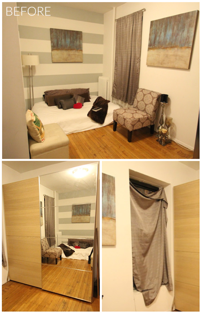
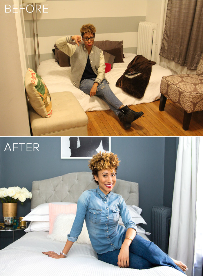
When my friend Elaine downsized from a large apartment in Harlem with roommates to a small studio in the West Village she couldn’t figure out how to make her apartment look cohesive and stylish so I agreed to come by to give her a few pointers. Living in New York I’ve seen a lot of small apartments but when I first saw Elaine’s place I was stunned! It was teeny tiny! The main living space is a little under 90 square feet and had a very tricky layout! And it was like the scene of a decorating crime. There was a mattress on the floor, curtains tacked haphazardly to the windows and it definitely didn’t reflect Elaine’s killer sense of style. I knew that transforming this space could be a fun challenge so after chatting for a bit we decided this would make a fun little small space decorating story for the blog and I called on some friends at Valspar Paint to help. Let’s take a look at the before pictures…the scene of the crime!
From the photo on top you’ll see that Elaine’s full sized mattress oriented horizontally almost touches each end of the wall. What makes the layout exceptionally tricky is that on the right there are windows that we did’t want to obstruct since it’s a ground floor apartment with little light. On the left wall which you can’t see in the photo there are closet doors that Elaine needs to be able to access and on the wall opposite the bed is a huge Ikea armoire that provides her with much-needed storage for her overflowing collection of clothes and shoes. These factors limited our furniture placement options tremendously. Elaine initially wanted to try and fit in a sleeping area with her full sized bed plus a sitting area for guests but since her bed took up most of the room, this was near impossible. I suggested removing the armoire to make room for a small settee in its place but that just wasn’t an option for Elaine so rather than trying to squeeze as much furniture as we could into the space, we decided to just own the fact that it’s tiny and not try too hard. We decided on a very chic, boutique hotel look with the goal of transforming the space into a beautiful, cozy sleeping area which works well for Elaine’s lifestyle since she is hardly ever home. As Teen Vogue’s Beauty & Health Director, she works a lot of late hours and attends nighttime events several times a week. On the weekends she’s usually out and about with friends or traveling so she was totally ok with this approach and also has a small eat in kitchen where she can entertain friends.
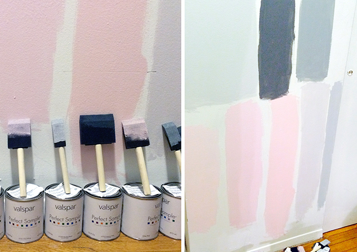
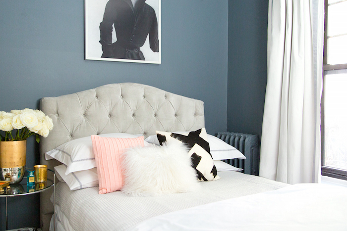
Once we established the direction of the layout, it was time to pick our color palette and align on design direction. I always use Pinterest as a collaboration tool and I asked Elaine to pin images of rooms that inspired her most. Elaine’s style is very feminine yet daring and the two images she was most drawn to were this photo and this one which represented two very different color directions – one being soft pinks and the other being various shades of gray. We picked up some Valspar color samples from Lowe’s and tested a ton of colors to see what felt right for the space. These were just a few of the ones we tried out. After seeing these up on the wall I ultimately felt like the pinks didn’t really have the edge that Elaine’s fashion sensibility reflects and the bold gray felt much more on point for her. We landed on a deep gray called Crucible from the Valspar Reserve line and it ended up looking fabulous! Here is the after…
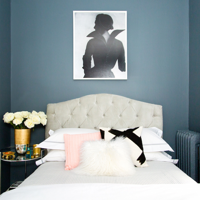
Most people would be afraid of using such a dark color in a small space but here it totally works. It envelops the room and gives it a very cozy feel. Plus, I picked out all white bedding to help bring in that boutique hotel vibe. It also provided a much needed contrast against the dark gray backdrop. The headboard, bedding and curtains that you see here are all from PB Teen. Additional Credits: blush pillow / fur pillow / graphic pillow
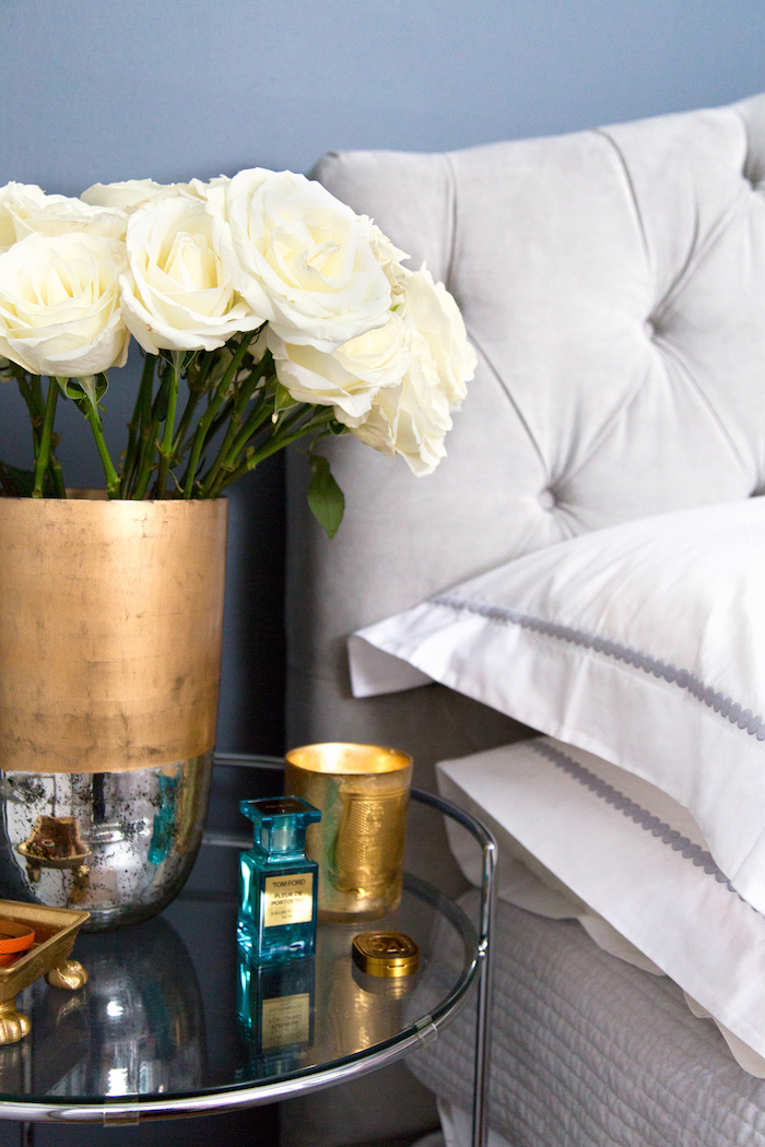
A few of Elaine’s favorite things on her bedside: favorite scent / favorite candle / favorite solid perfume / gold catchall / vase
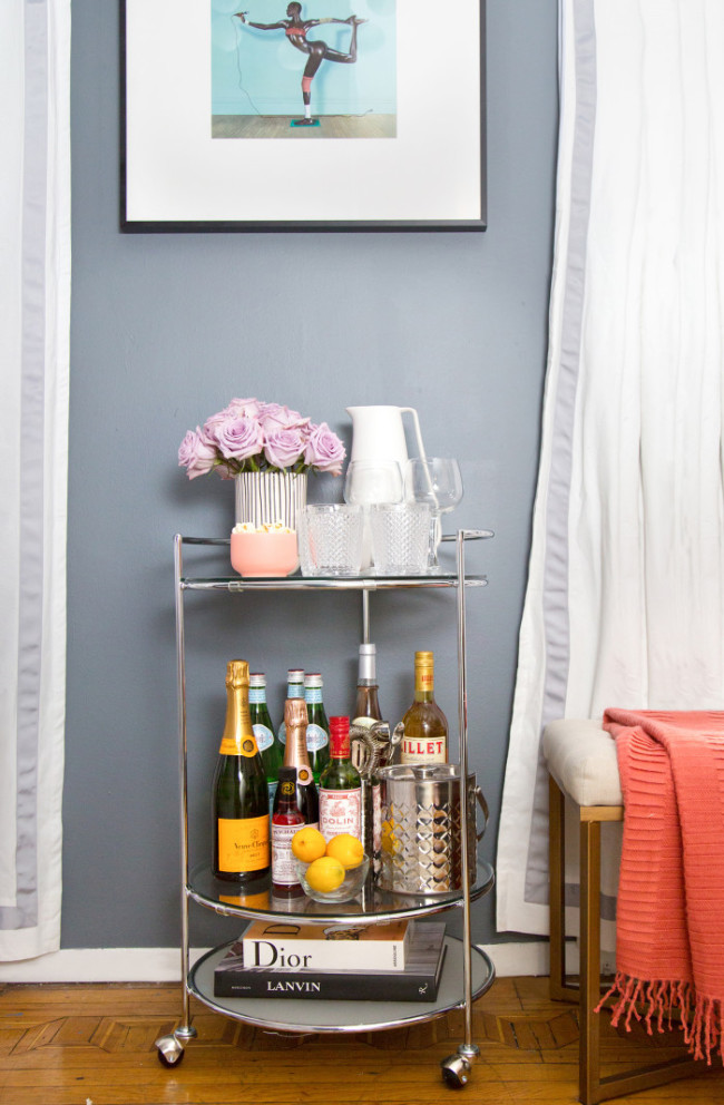
In a small space it’s important to have furniture that does double duty. Elaine’s chrome bedside table is actually a very versatile cart from Lowe’s. It’s on casters and when she has company over she wheels it out into the main living space and it becomes a bar cart for entertaining!
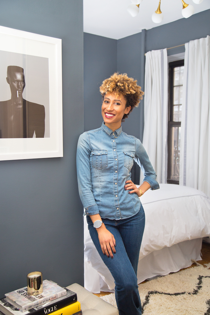
Elaine had access to some pretty cool art from her office and the iconic Jean Paul Goude print of Grace Jones hanging above the bar cart is one of her favorites! crystal cut double old fashioned glasses / pink bowl / pitcher / vase
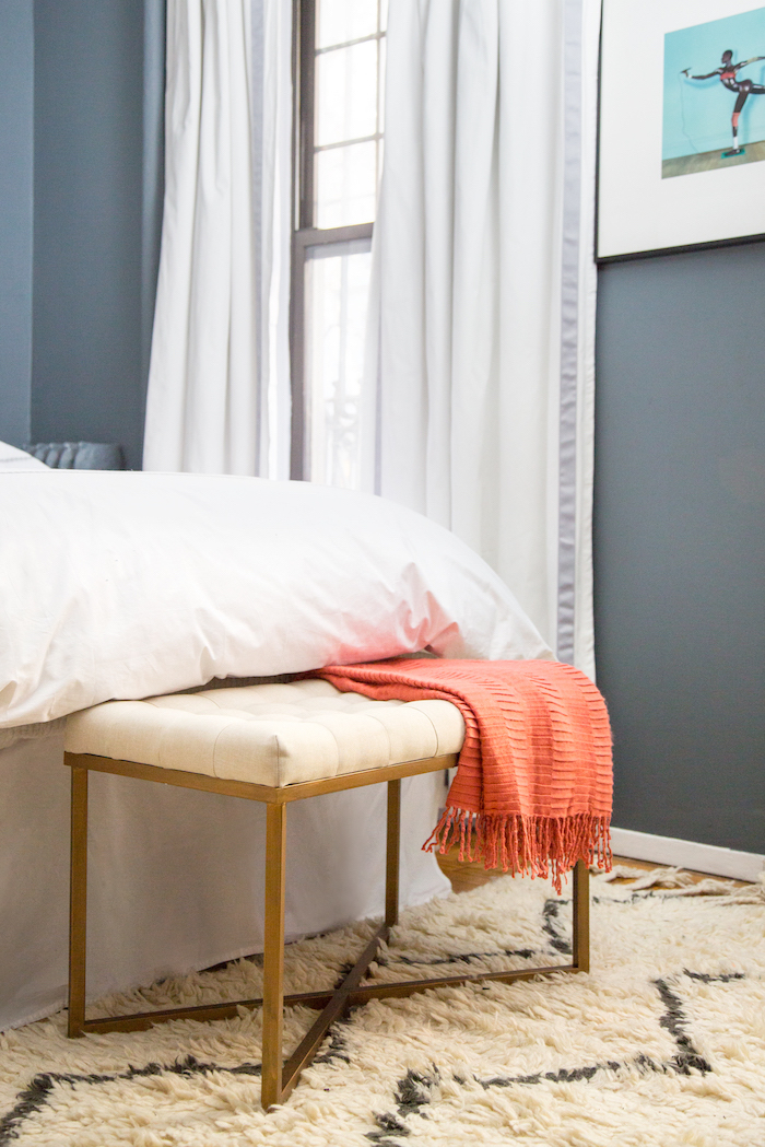
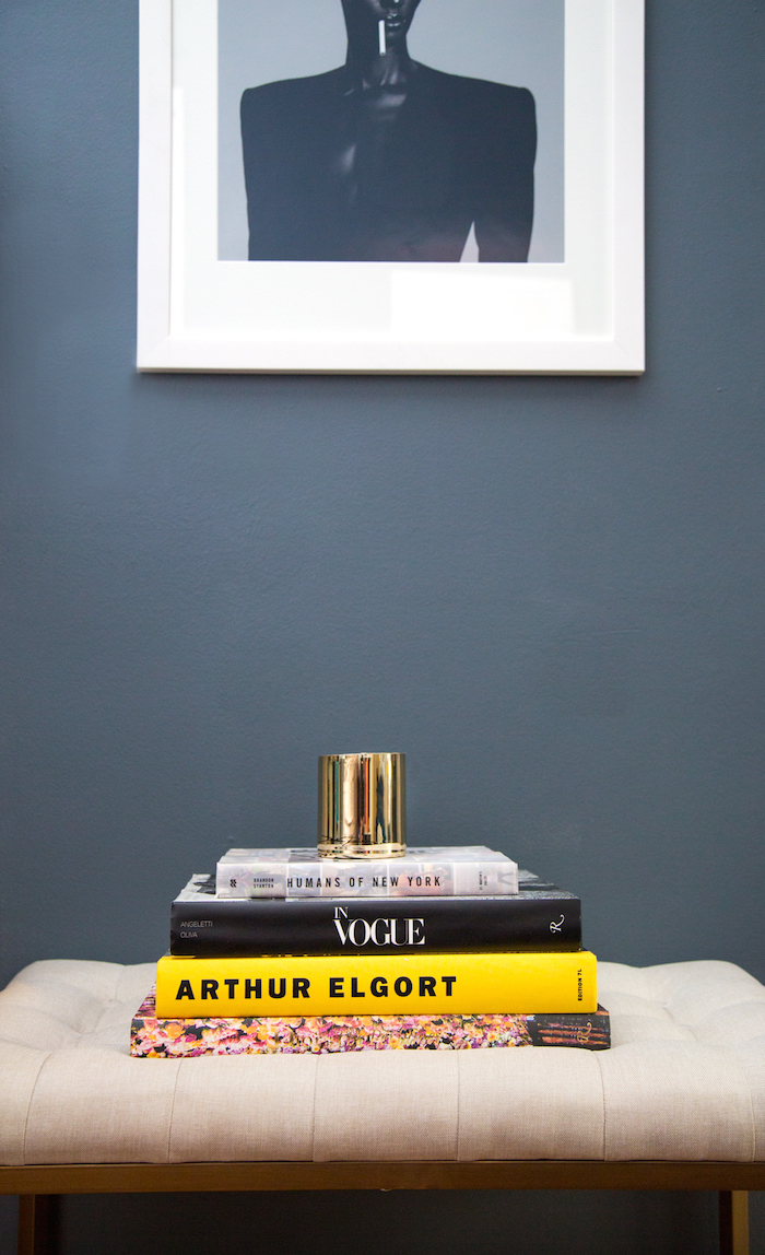
Another furniture piece that does double duty for Elaine is this bench which was an affordable find from Target! When she has guests over she places it in front of her bed for extra seating.
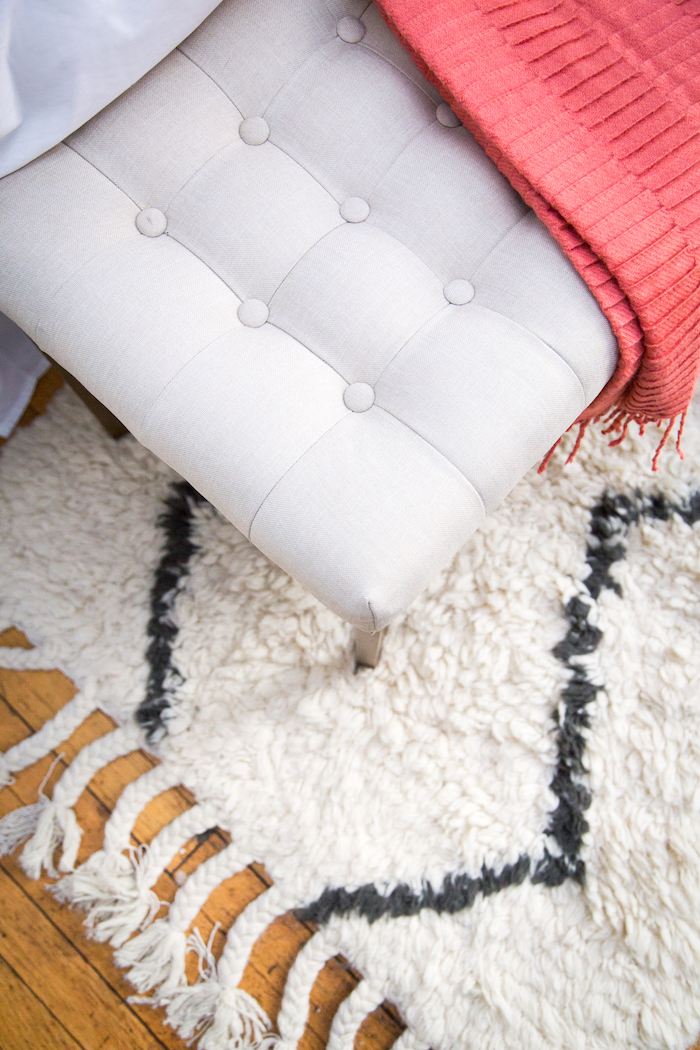
Here’s a closer look at the details…. Bench / Rug / Throw
Elaine, standing at the entry of her apartment. When she doesn’t have guests over, the bench is usually placed here to help make her entry more inviting. Above it is another favorite Jean Paul Goude print of Grace Jones – one of Elaine’s style icons!
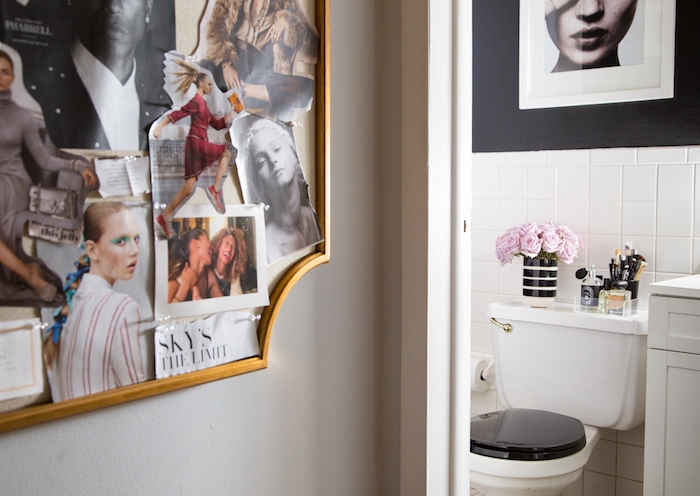
In the tiny hall leading into the bath (see her totally chic bathroom makeover here!) we placed an inspiration board from PB teen on the wall where she shares all of her favorite sources of style inspiration.
And the final before and after comparison – It doesn’t even look like the same room! Need more inspiration for small space decorating? Leave a comment or question below and I’ll address some of your questions in a future blog post!
Thanks to our friends at Valspar Paint for having such an awesome color range and for making this post full of small space decorating inspiration possible!
Photos by Stephania Stanley
PS – See Elaine’s bathroom makeover HERE







21 Comments
I loved the bathroom and now I love the bedroom. I really appreciate your explanations of how you approach the space and the give and take decisions you made to make the best use of the limited real estate. I wonder if it would be possible to have a floorplan? I always find that helps me get my head around a space, especially one as small as this.
I literally just died from a GORGEOUS overdose! Such a lovely and inspiring makeover. I love that you give the insider deets on everything. Thank you + I am now thinking I need to get me some interior designing friends LOL. **hugs and hi5s**
You did an amazing job with this before and after. It’s hard to grasp just how teeny tiny her apartment is, but your designer touch definitely infused this place with life and matched her personality. If only you cold come revamp my studio! lol…
This space looks absolutely gorgeous! You guys did a great job with the transformation. Who knew such a small space could be so chic?
Wow, this looks incredible. You did a truly amazing job.. It doesn’t even look like the same space! I am thoroughly impressed with your work!
Incredible change! Smart!
Check out my art prints!
I honestly can’t believe an apartment that small can be that glamorous! Nicely done. Any advice for lighting in a bedroom when there’s no room for bedside tables and you’re stuck with renter restrictions? My new bedroom is super narrow and my queen bed fits with less than 10″ to spare on either side. A well-placed windowsill is great for storing a book and other bedtime essentials, but I’m at a loss for where to put a reading light. Sconces are out since I’m renting, so I’m on the hunt for teeny tiny tables and skinny lamps…or a better idea?
I really like how you made the most of the space with white, luxurious touches and thoughtful details. Years ago I lived in a small, one-bedroom cottage and it was a challenge to decorate. You did a wonderful job!
I love it! Well done
What a transformation! I love it all. So inspiring!
When I hear “small space” I think 200 sq.ft. or so, not 90!! What an amazing, glamorous design. Well done. I love the dark gray walls.
Such an awesome transformation! –You’re so talented
Wow! What a beautiful transformation. I love it!
This transformation is incredible! You totally changed that space from top to bottom — it’s classy, elegant, fun, and functional! Check out feltballrug.com for more of the same!
Elegant!
Elaine is adorable & so is her new pad. PS — you can’t go wrong with lilac roses.
http://www.picme.com
WOW. This transformation is ah-mazing! The paint made a huge difference to the room, and i love how girly yet modern her home is. Im totally going to find that bar cart (I’ve been searching for one for ages), and this gave me some decor inspo for my own home. Im so glad I stumbled across your instagram account + blog!!
Kimmie
http://www.kpfusion.com
Absolutely wonderful! Also, Elaine is super cute with her thumbs down and happy, smiling thumbs up! : )
Pingback: A Teen Vogue Editor's Stylish Rental Bathroom Makeover | sohautestyle.com
Pingback: Elaine Welteroth's Apartment on The Coveteur | sohautestyle.com
Super-wow! it is very coozy. You simply can’t go wrong with colour matches and the dark wall colour blends well with the white linens. This is truly inspiring.