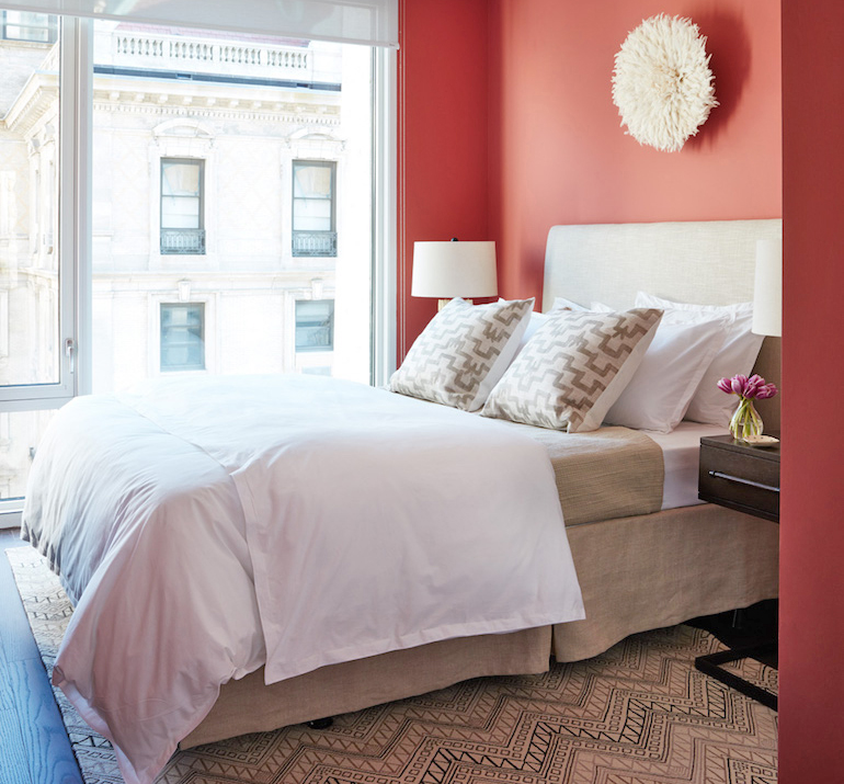
I always believe that when executed well, the use of color can be the single most transformative design element in a room. Case in point: this cheery, boho-modern bedroom I designed for a model apartment project that debuted last year. I can’t believe I haven’t shared this one with you yet but I’m excited to finally show you this lovely space! Let’s start the reveal by taking a look at what the room looked like before…
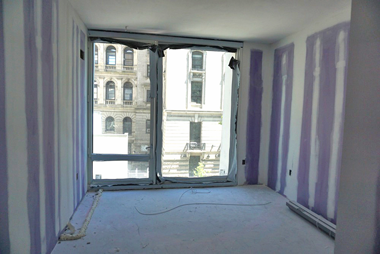
Since this was a model apartment, I began the design planning before there were even walls up which is really tough to do because even when you understand dimensions and spatial relations, it’s hard to fully absorb the magnitude of a space until you see it. In this case, once the framing and drywall went up, this room seemed MUCH smaller than it did on the floor plan! Luckily, everything worked out well and here is what the space looked like after…
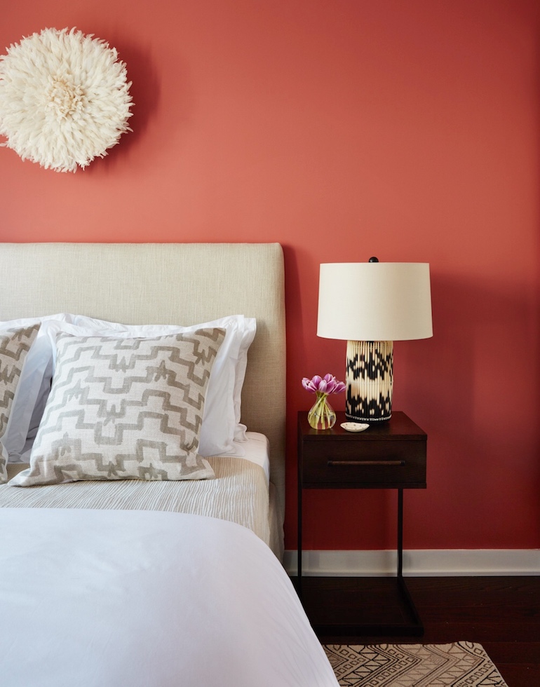
Developers usually want model apartments to be all neutral so that they can appeal to everyone but in this case I had a tiny bit of leeway since the building was being marketed to a very young demographic. The clients wanted the models to not only look great but also feel fresh and youthful and I think we achieved that with the use of a strong color on the walls. Since the furnishings were all neutral I went with a very punchy coral paint color which makes the room feel vibrant and fresh. The color is Lip Gloss from Benjamin Moore.
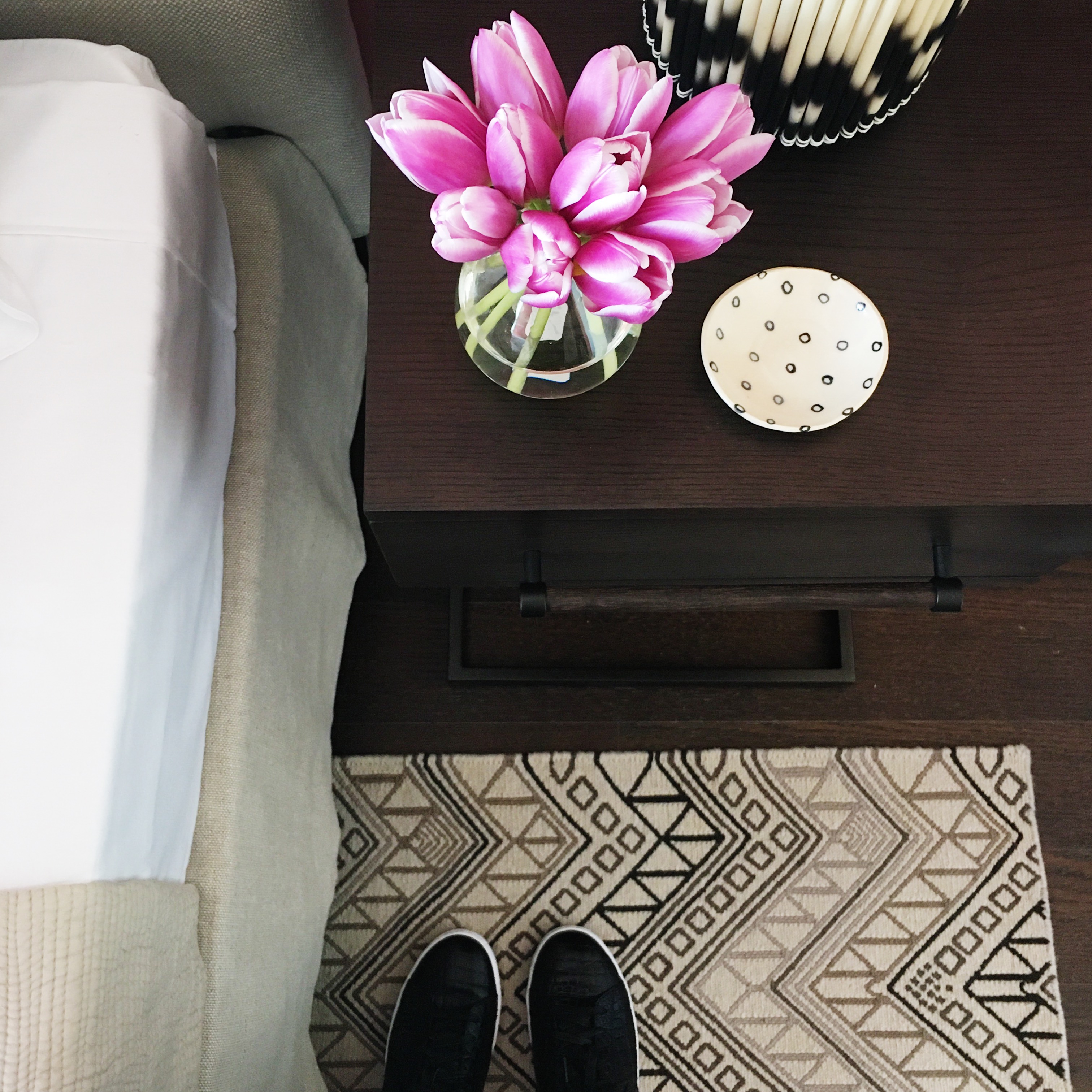
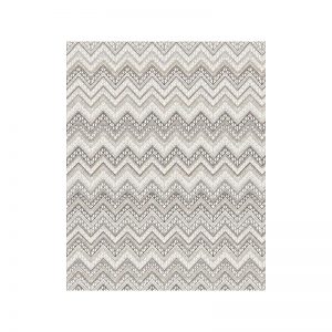
I wanted this space to have a global, ethic-inspired vibe and sine the wall color was bold I kept the furniture and accessories neutral. The first thing I picked out was this beautiful flat weave rug from my friend, carpet designer Malene B. She had recently introduced flatweave rugs into her collection and this style called Maya was just right for the room. The bold pattern really helps to ground the space and give the room some energy. I love that I was able to customize the yarn colors as well as the size to fit the room perfectly.
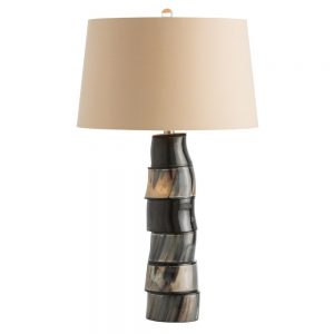
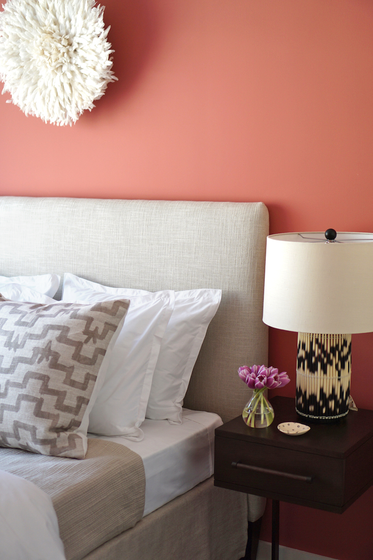 I also really loved this lamp from Arteriors which is sadly no longer available(similar vibe here). The cylinder base features faux porcupine quills and it ties in with the exotic, global feel of the prints and patterns in the room.
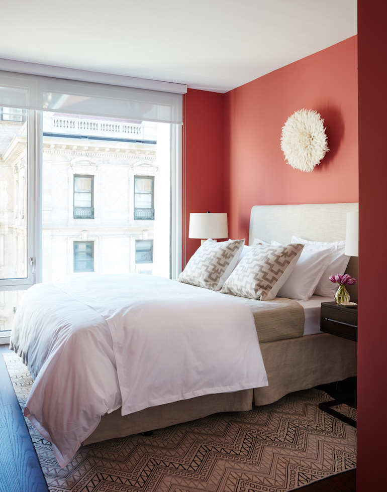
One bummer on this project is that since this model apartment was in a rental building, the clients didn’t want to include curtains because the apartments all came with standard roller shades and they thought curtains wouldn’t feel accessible to prospective renters. I totally get it but even through the space turned out great, I can’t help but feel like the room lacks that final layer every time I see these pictures. I wish I could have have included some soft, sheer ripple fold style curtains which would have softened up those windows and made the space feel complete. Sigh! The strong color on the walls definitely helps trick the eye away from the windows which in addition to featuring the simple roller shades, also has a view of another nearby building.
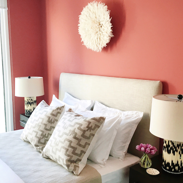
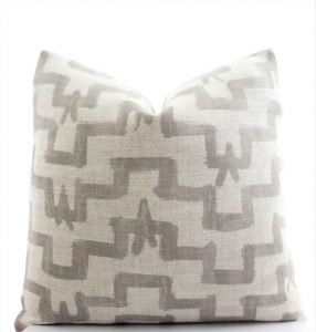
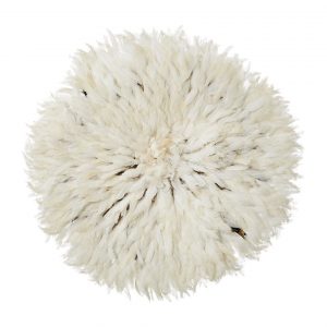
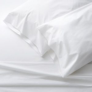
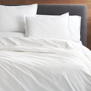
To dress the bed, I chose crisp white bedding accented with throw pillows featuring a favorite fabric from Zak + Fox called Tulu. It’s inspired by an iconic Turkish carpet design. I had these ones made custom but you can find similar styles in the exact same fabric on Etsy. Instead of artwork, I opted for a tribal Juju hat as a wall hanging instead. The Juju hat is a ceremonial feather headdress worn by members of the Bamielke tribe in Cameroon. It has an almost sculptural feel that adds so much interest and makes for a great statement piece. Which element of this bedroom is your favorite? I’ve included all the links below so you can shop the look!
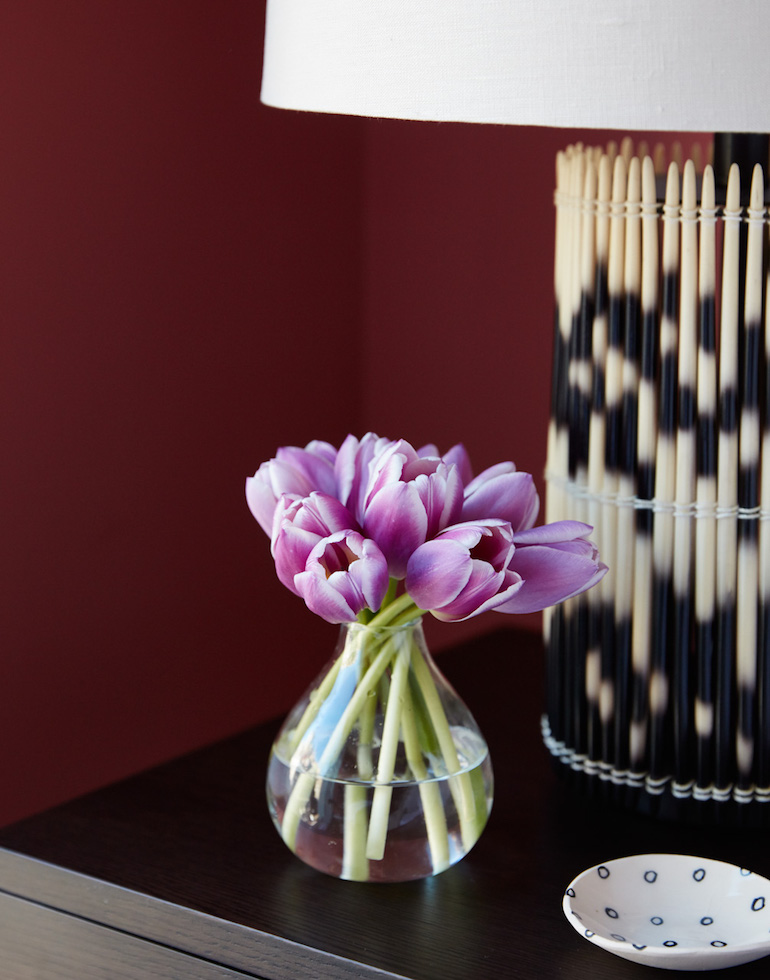
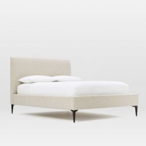
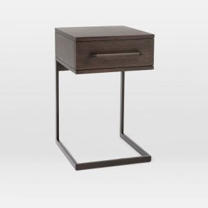
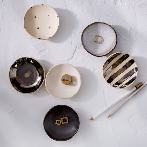
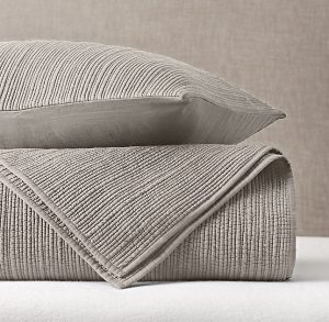
1. Bed (similar) / 2. Juju Hat / 3. Nightstands / 4. Duvet / 5. Sheets / 6. Rug / 7. Throw Pillows / 8. Lamp (similar vibe here, here and here) / 9. Coverlet / 10. Jewelry Dish / 11. Bud Vase


1 Comment
Wow! Stylish design , i like it very very much