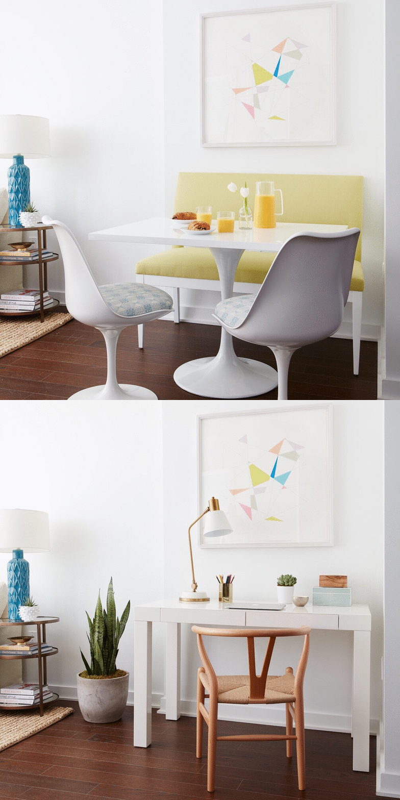
What to do when you have an awkward corner in your home that you just don’t know what to do with? Coming up with a functional use for a tricky space that feels useless can definitely be a challenge but with a bit of inspiration and a few new pieces of furniture you can make an awkward corner look pretty and purposeful. The space you see here was actually a model apartment I designed and since no one actually lived there had the flexibility to experiment with different ideas.
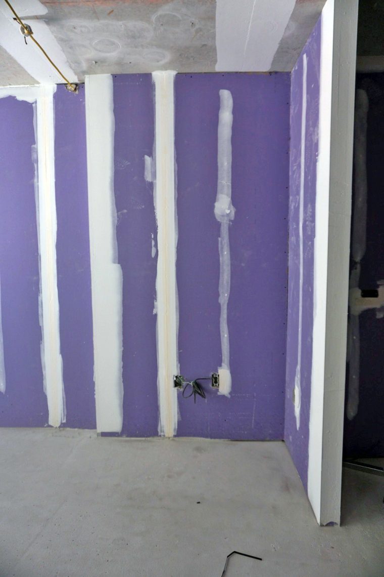
This was the space when it was still under construction. I remember being annoyed with the placement of this awkward corner right off the living room but instead of viewing it as problematic, I quickly saw it as an opportunity to get creative. My first thought was to turn this into a cozy little dining nook so I set out with this original plan. The apartment building happens to be situated right next to Columbia University and after we installed all of the breakfast nook furniture, my clients thought it looked great but said “hey, a lot of Columbia students will probably rent here so maybe we should add a desk and make this a study area instead.” So in one day I quickly pulled together a new scheme for a study nook and it turned out super cute if I do say so myself:) Below is a peek at how I designed this one nook two ways plus some picks to help you achieve this look in your own home!
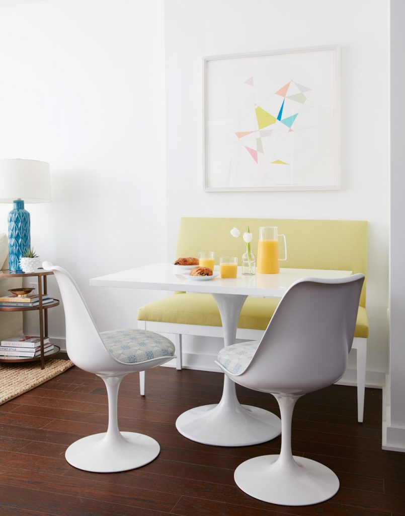 I knew this space would make for a perfect breakfast nook. The challenge was that the space is quite small and not very deep so there wasn’t enough room to float chairs around a table in this tiny little corner. The solution was to bring in a small banquette that could sit flush against the wall and not take up too much space, allowing for a narrow rectangular table with two chairs floating out on the opposite side. I found this banquette from Robert Allen which has an lovely open back detail that you can’t see in the photos. I upholstered it in a lime green ticking stripe which lends a casual feel and tied in with the color palette in the rest of the apartment. I love a good Saarinen style tulip table. I use this style over and over in projects and it’s a style that works well in a modern or a traditional space. Since I needed a rectangular shaped table and a rectangular tulip table wasn’t readily available in the small size that I needed, I ordered an inexpensive replica Saarinen table with a round top and had a custom lacquered rectangular top made to fit the base. While I recognize that custom isn’t always the most budget-friendly option it’s definitely the best way to get exactly what you want when you cant find it anywhere else. The chairs here are from Knoll upholstered in a Suno for Knoll Luxe fabric. The art print is from Minted and I just love the geographic shapes and punchy colors. Now, this super tiny space that was once a weird and useless is now a warm and inviting dining area that seats four!
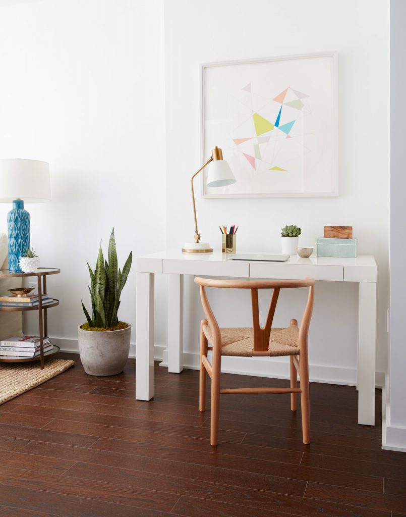
Here’s the same space reimagined as a study nook. Since the space is meant for studying, a great desk and chair were a must so I brought in a classic Parsons desk in white and paired it with a wishbone chair in a natural wood finish for a warm contrast. We kept the same artwork used in the dining nook and the final step was bringing in just the right lighting and accessories to give the space some style. Hints of greenery also help add color and life. Isn’t it incredible how just a few key pieces of furniture can transform an awkward space and give it purpose? I just love the dining nook but the study nook also looks fabulous…it’s hard to choose which space I like best! Which one is your fave? Keep scrolling for ways to get the look!
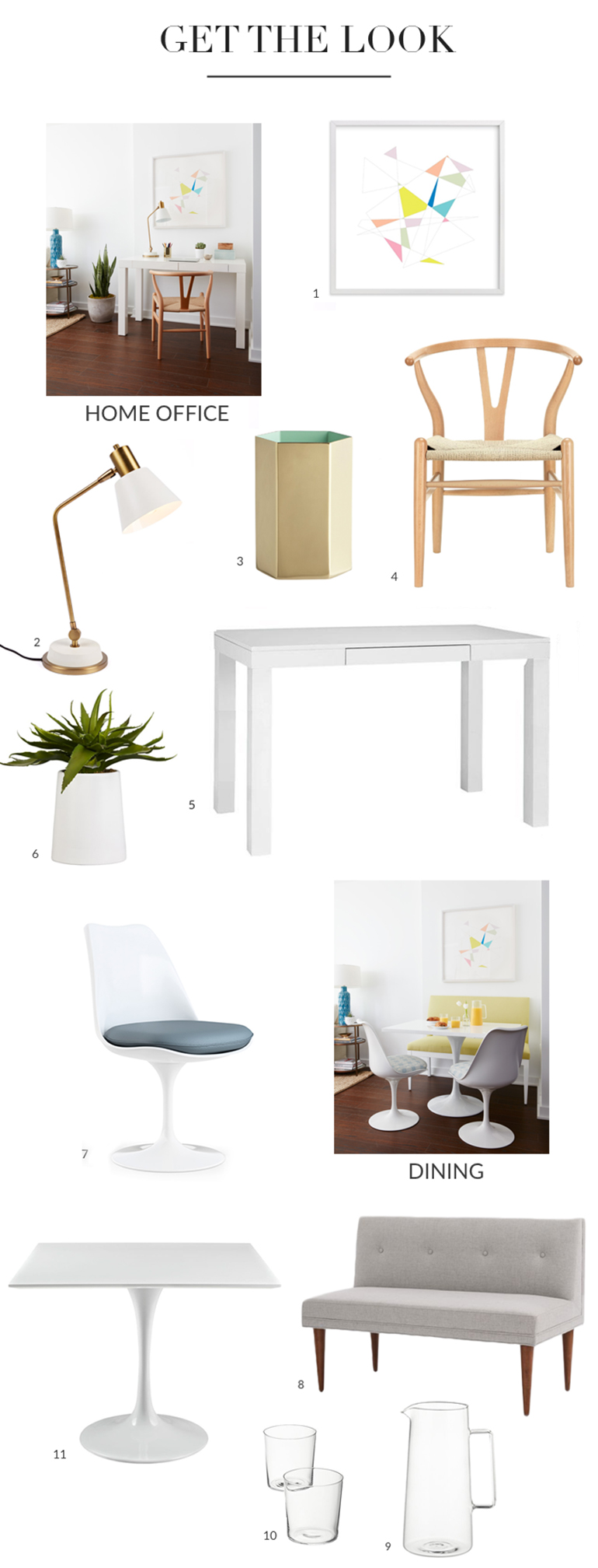
- Art Print / 2. Table Lamp / 3. Pencil Cup / 4. Wishbone Chair / 5. Parsons Desk / 6. Potted Aloe / 7. Tulip Chair / 8. Banquette / 9. Pitcher / 10. Highball Glasses / 11. Tulip Table





2 Comments
I LOVE the idea of using that space for a banquette and dining. Perfect use of the space and unexpected. The desk is a good choice but a more common one.
I prefer the study nook because it would get far more use AND you can eat at it also. But they both look great.