A friend recently moved into a new condo and over the past few months I’ve been helping him transform his new place into a home. It’s a new construction condo so all of the finishes were chosen by the builder and while they weren’t completely awful, some of the choices simply lacked style and didn’t reflect my friend’s aesthetic at all. The condo has four bathrooms and after the expense of purchasing a new home, completely renovating four baths was not in the budget so instead, I helped him make a few simple updates to give the bathrooms a bit more style and personality. I’m excited to show you what I did with one of those guest baths and I mostly focused on one key element of the space – the hardware!
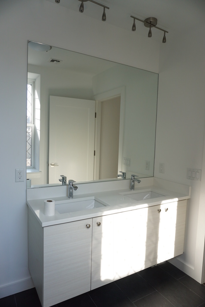
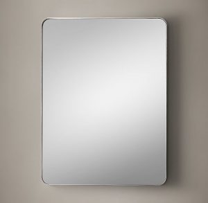
I don’t have a great before photo but here’s one shot of the guest bathroom before I gave it a refresh. One of the things that bugged me the most is that the space featured a mix of different hardware finishes. There was chrome and polished nickel and brushed stainless steel – nothing felt coordinated or cohesive. Also, the lighting needed a major update. In this photo you can see these weird spotlights that were installed pointing downward from the ceiling, an odd location that created the most unflattering light. I’m also never a fan of the large slab of mirror that’s adhered to the wall – there was definitely an opportunity to bring in something much more stylish. Take a look at the after…
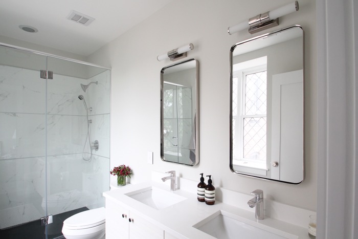
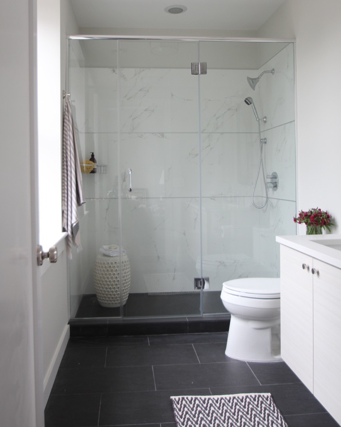
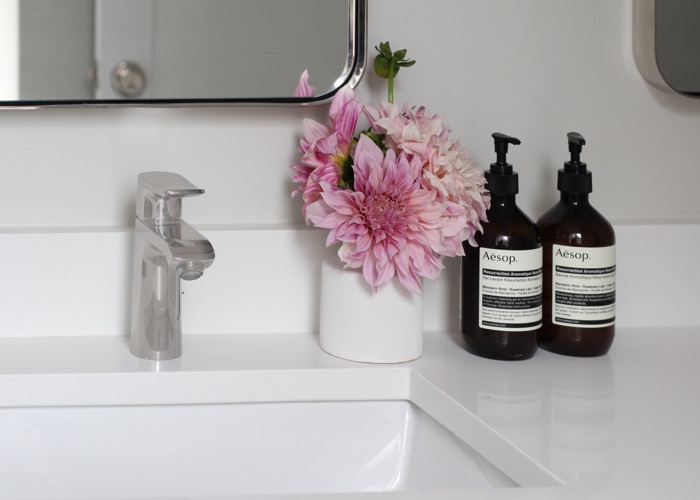
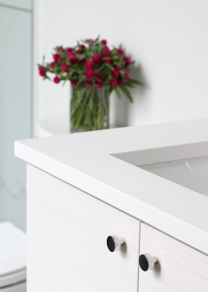
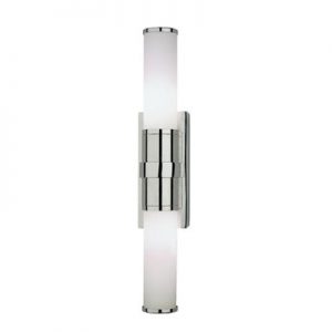
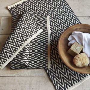
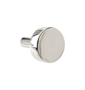
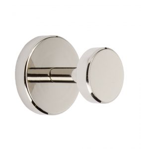
For this update I switched out all of the hardware, from the cabinet knobs, mirrors and lighting to the doorknob opting for polished finishes that gave the space a more sophisticated feel. The walls were painted Benjamin Moore’s Winter’s Orchard which has a calming, spa-like effect in the room. It’s still bright and airy but not as stark and clinical as plain white. Since this was a guest room that wouldn’t receive frequent use, we kept the original faucet. While it wasn’t what I would have picked but it works just fine in the space and helped keep the overall refresh more budget friendly.
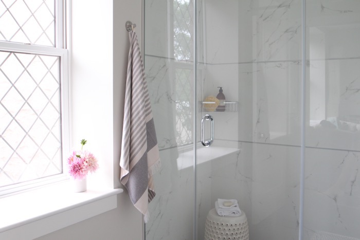
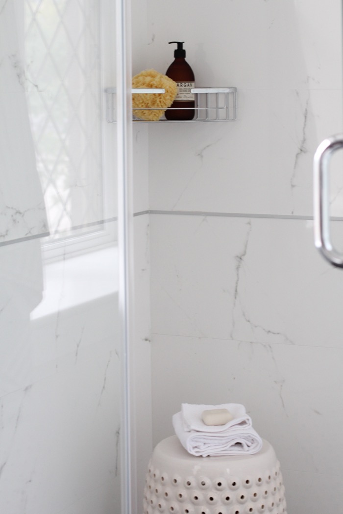
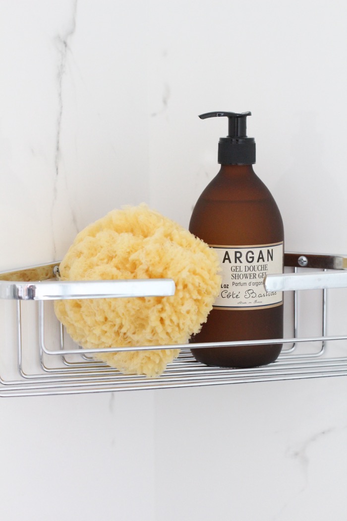
For added functionality, I placed a corner basket in the shower. Previously, there was no space to put shampoo or toiletries so this was a must.
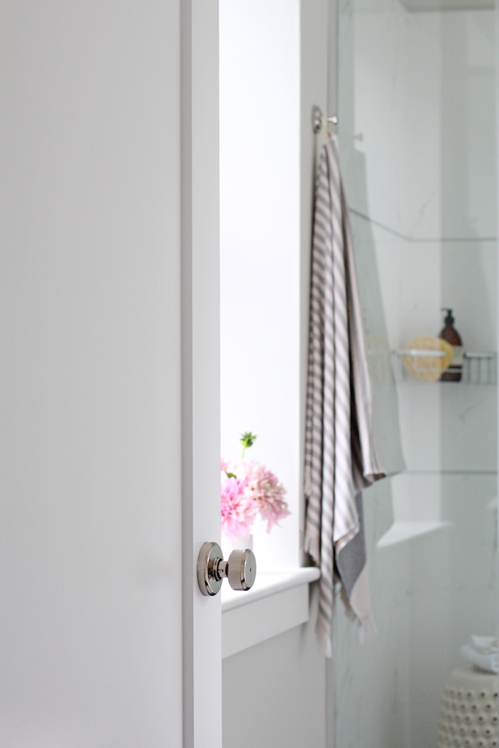
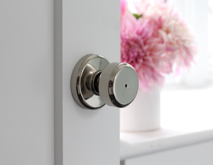
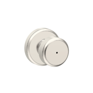
In the before photo you can see in the mirror reflection that previously there was a very basic door lever in a brushed stainless finish. I upgraded to this Bowery knob from Schlage which has a much more refined look.
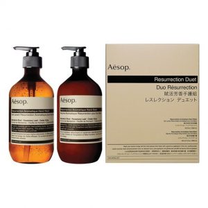
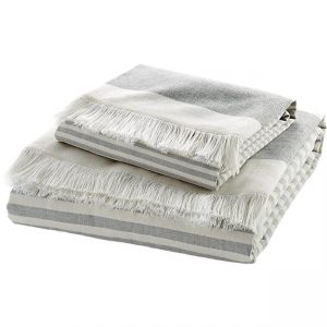
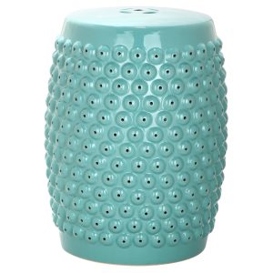
I just love how this space turned out and all it took were a few easy updates! What do you think of this simple bathroom refresh? If you’d like to know how to get the look, check out all of the links below!
820d50b43b3559e481cd2ddeda7ea1df24168b4b2799c915d5
Big thanks to Schlage for sponsoring this post!





1 Comment
What would you think of using the Georgian knob from Schlage with the same finish?