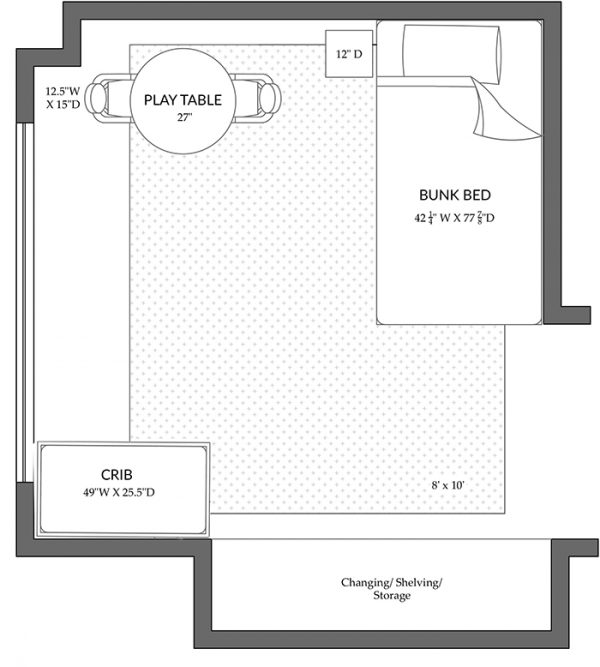
A while back I worked on a project for a young couple who hired me to redesign their two-bedroom apartment. (You can see more of that project here.) The apartment’s smaller bedroom was occupied by their adorable toddler son who loved dinosaurs and was finally ready for a big boy room. But, a couple of months into the project, the family learned they were expecting baby #2! How exciting! The kicker for me is that they wanted to keep the gender a surprise so I now had to turn what would have been a big boy room into a shared, gender neutral space for big brother to share with his new sibling. And being New York City where apartment homes are much smaller, space was limited! The must-haves for the room were a bed for their older son, a crib for the new baby, a play area, plus they wanted it to be a space that the kids could grow into in the event they were in the apartment for several more years. I began the process by creating a new floor plan and here’s how I tackled all of the challenges…
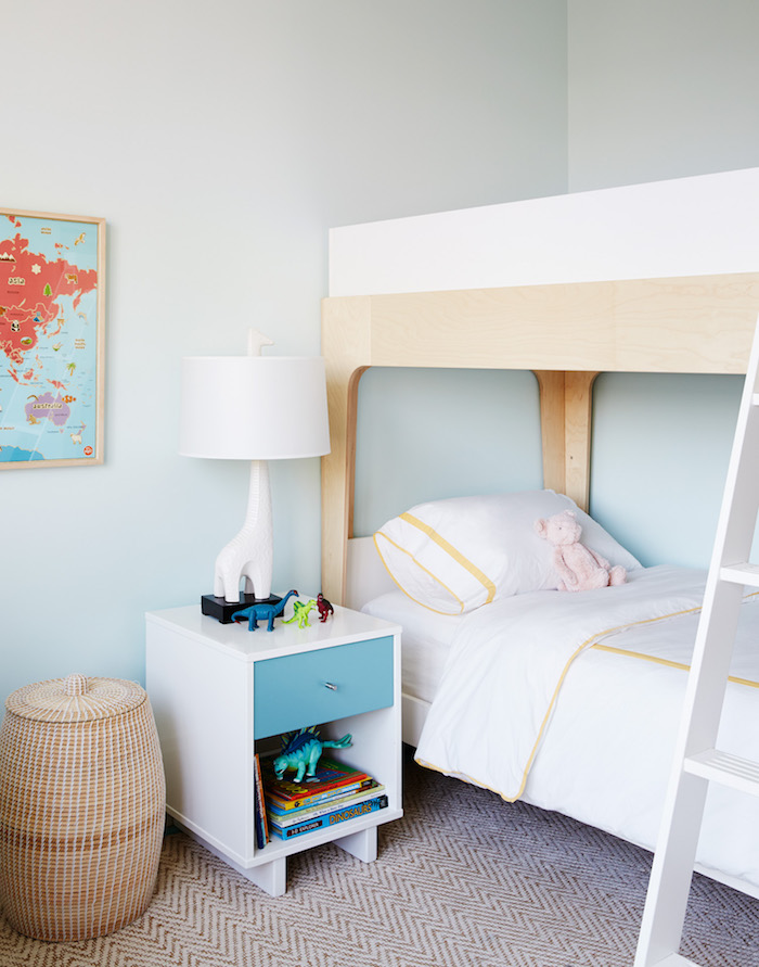
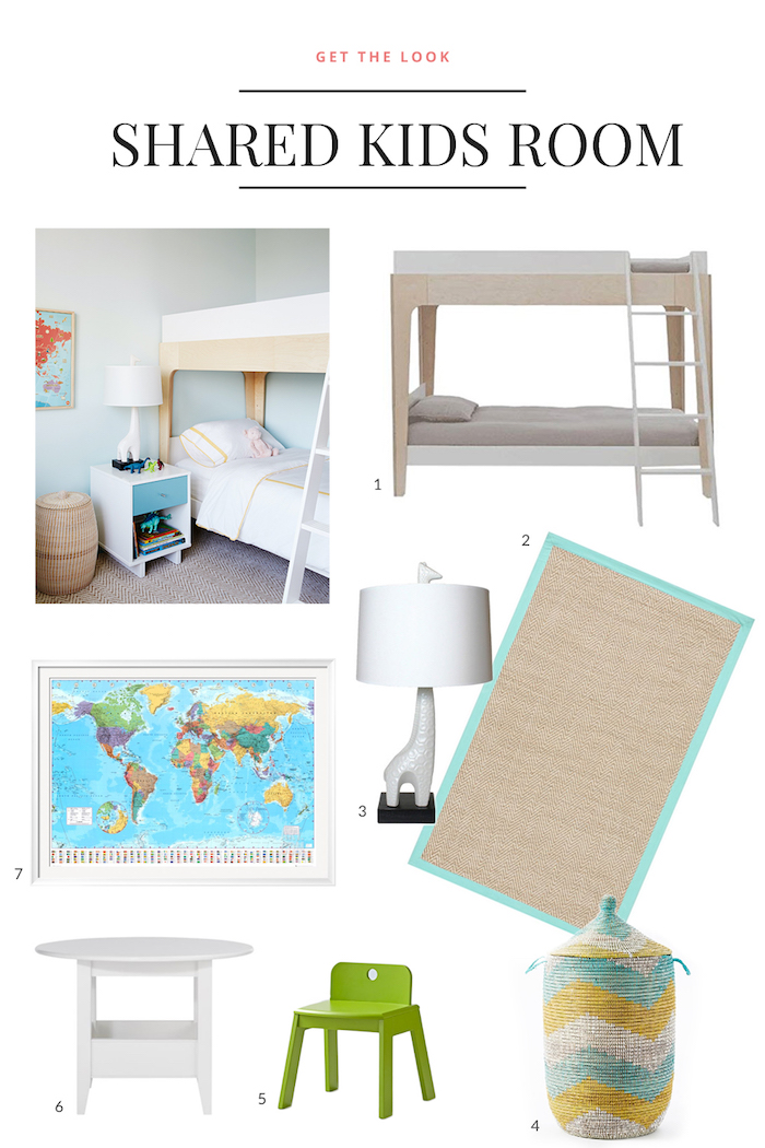
The solution to creating a space that could grow with the kids as they get older was to bring in a bunk bed! Big brother would sleep in the bottom bunk and once the new baby was out of a crib, big brother would trade places to the top bunk so the little one could take the bottom. We tucked a compact crib in the corner and a play area on the opposite side of the room – and there’s still a decent amount of space in the center for the kids to play.
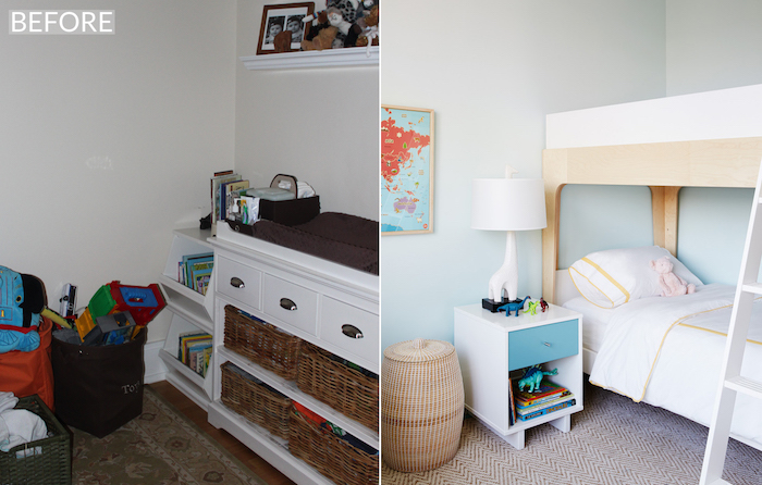
Here’s a before and after of the corner where the bunk bed is now situated. Before, the colors were rooted in shades of brown and beige , not quite what you’d expect for a kids space so we lightened everything up to make it feel bright, fresh and youthful. The color on the walls is Benjamin Moore’s Spring Mint.
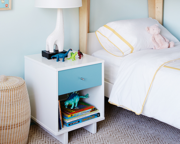
I wanted the space to have a decidedly modern feel so all of the furniture is very clean and streamlined. The cute little side table added a fun pop of color plus some needed storage for all of their adorable little dude’s dinosaur toys and books! The rug brings in a ton of texture and helps to ground the space, plus it provides a soft surface for the kids to roll around on. And how cute is that lamp!? It’s technically a giraffe and not a dinosaur but I knew my young client would love it!
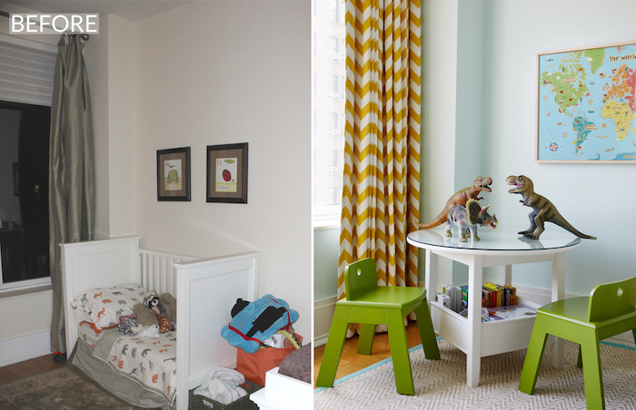
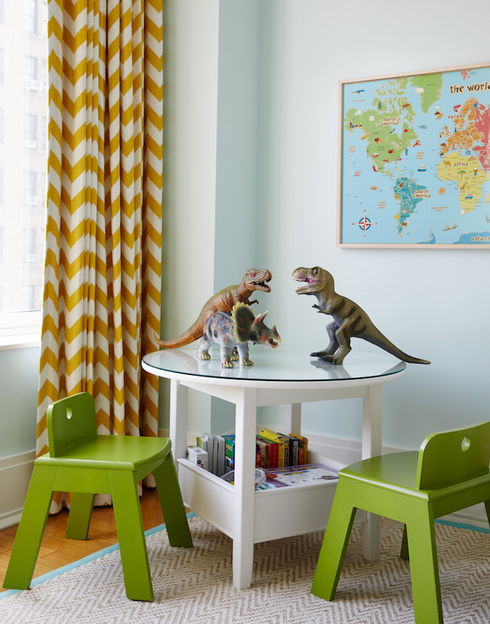
Here’s a before and after of the corner where their son’s converted crib bed used to be. Now, a play table and chairs make for the perfect spot for coloring or learning lessons! I love the added storage feature in the play table because anytime you’re tight on space, multifunctional furniture that can do double duty is a must!
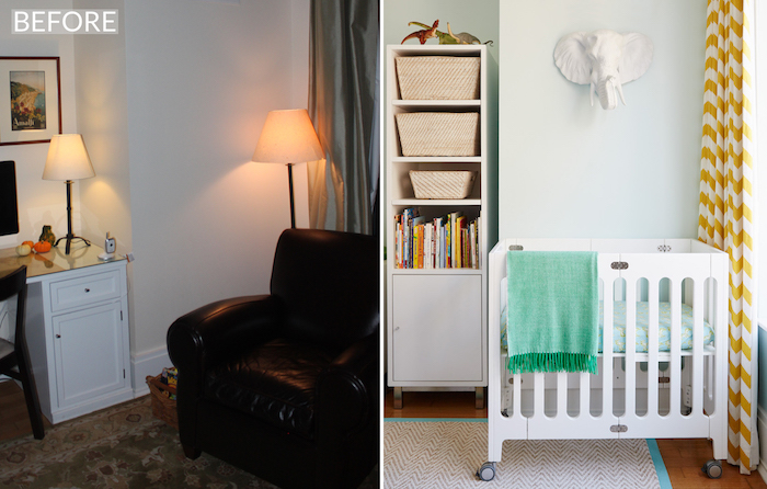
The custom curtains in the room were made with a fun Jonathan Adler chevron fabric from his collection for Kravet.
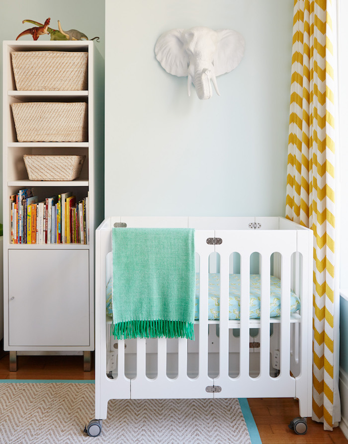
The room used to double as an office and in this corner there used to be a large desk with a computer plus a big brown leather club chair. The change was pretty dramatic! My clients wanted to incorporate the smallest crib possible and they found this adorable mini crib online. While a mini crib many not be practical for everyone, it worked perfectly for their needs and it fits perfectly in this little corner! The tiny crib mattress is a european size and we picked out standard crib sheets from Serena and Lily and a tailor alter them to fit. We hung a white faux taxidermy elephant above the crib for a whimsical touch!
One thing I did at the start was to encourage my clients to spend some time de-cluttering before we bought in new furniture because along with a new baby comes lots of new things! So they got rid of a ton of old toys and books to make more room and it also helped to make the space more visually appealing. I also ordered a custom storage unit from Room and Board to house toys, books, clothes and any extra clutter. I regret not photographing the entire storage unit but the morning of the shoot we had sooo much to do and styling bookshelves takes up a ton of time so we had to prioritize. But – if you can picture it – the unit has two of the storage towers that you see here in this photo on either side and a low set of drawers in the middle with a changing table on top and a cool piece of art above. The room also has a closet so with the addition of the new storage unit, there’s now plenty of space for both kids’ things. Oh – and if you’re wondering, they had a girl!! What do you think of this room makeover? Have you struggled with how to transform a room for one child and make it functional for two? Below are a few ways you can get the look!
1. Crib / 2. Rug / 3. Lamp / 4. Storage Basket / 5. Chair / 6. Play Table / 7. Map




1 Comment
Beautiful room!! I am sure they will love it! x