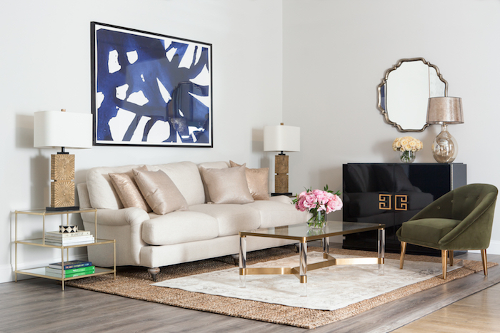
I recently finished up a charity design project for a wonderful organization called Housing Works that supports the HIV/AIDS community in New York. You’ve probably heard me talk about their Annual fundraiser called Design on a Dime here on the blog before. It’s a charity shopping event where interior designers create beautiful rooms and everything is sold to benefit Housing Works. This year I co-chaired the event and teamed up with Lowe’s to design a room for the event and I’m excited to show you inside the room! When you partake in an event such as this, it’s typically at a venue that is rented and you have a ridiculously short window to pull it all together. In this case, I designed an open concept kitchen, living and dining room and had less than 24 hours to install everything! That’s right…building walls, installing flooring, tile, kitchen cabinetry… everything. Just a few short hours to do it all! It was a pretty insane timeline and of course with things like this there are always a few inevitable hiccups that we had to just just roll with but all in all, I think it turned out pretty fab! The entire room was just 10′ x 24′ and although I was working within tight quarters, the small space represents how many New Yorkers live. Here’s a look inside!All of the furniture and appliances in the room sold out in mere minutes so its safe to say it was a smashing success! AND – EVERYTHING in the room is from Lowe’s and its sister company ATGStores! All sources are below.
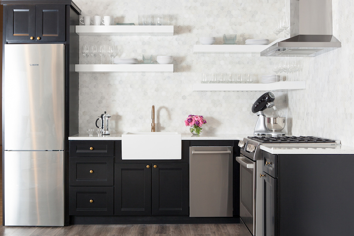
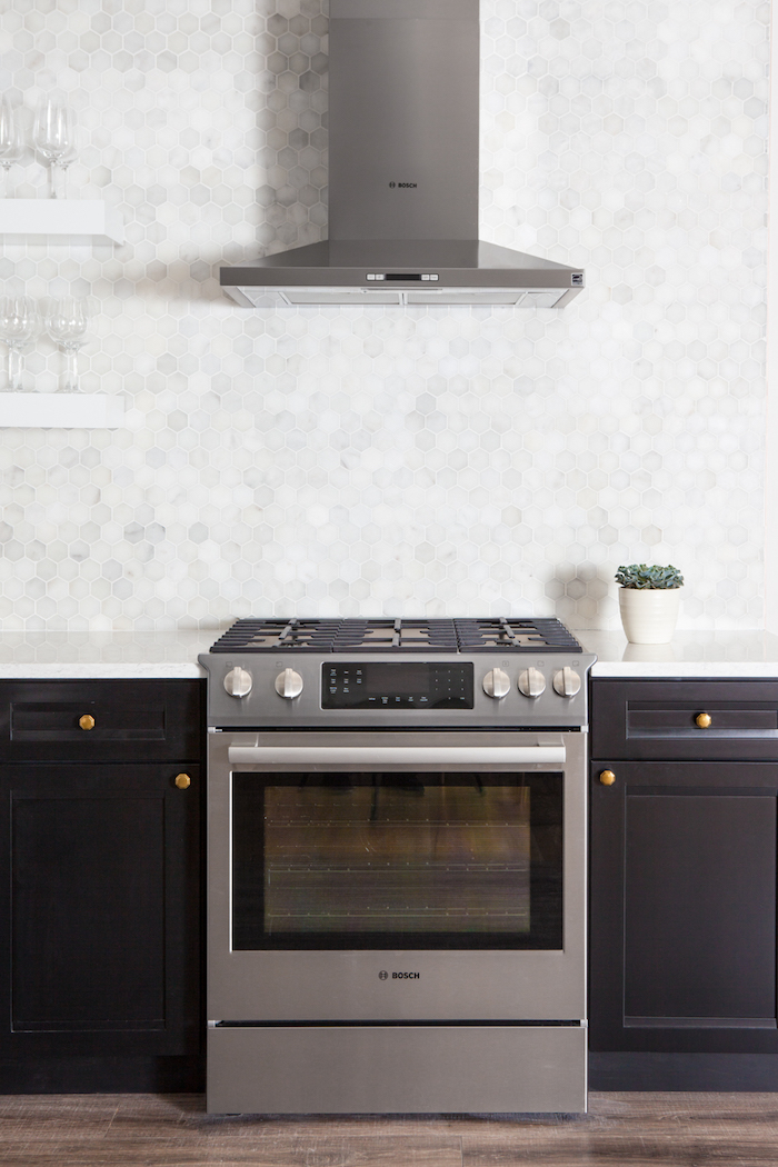
The kitchen was really the starting point for the entire design. When I began planning the space I knew I wanted bold black base cabinetry combined with open shelving up top and brass hardware and so that’s where I started and everything else fell into place from there…
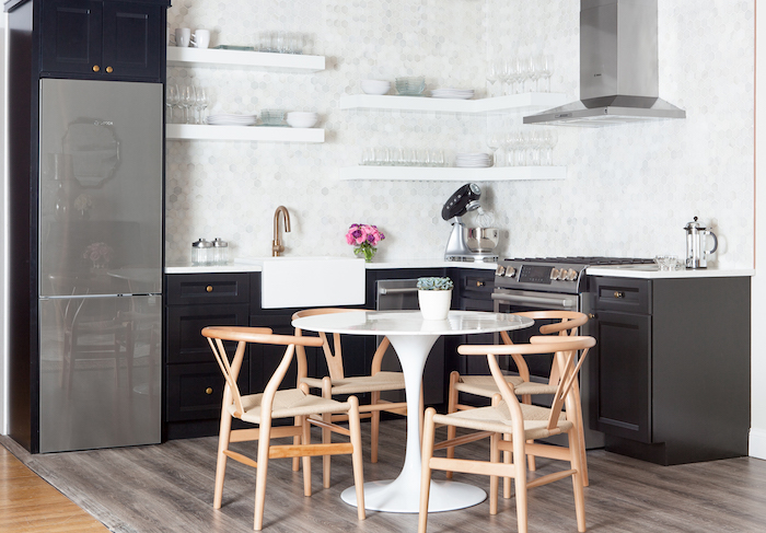
I wanted modern, streamlined appliances that would enhance the look and feel of the space and the Bosch assortment available at Lowe’s was perfect! One of my favorite pieces is the glass over stainless steel refrigerator from the Bosch 800 series range. It has such a beautiful, reflective quality and at just 24″ wide, it’s just the right size for small spaces. Another element that really elevated the space was the flooring. I used laminate flooring wth a grayed oak look from Pergo Max that I found at the new Lowe’s Chelsea store in Manhattan.
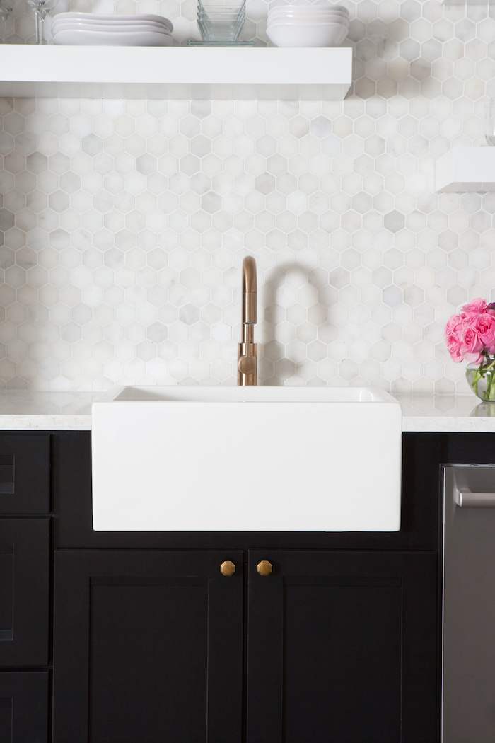
I love a strong contrast and the black cabinetry against the white marble tile and farmhouse sink looked absolutely stunning!
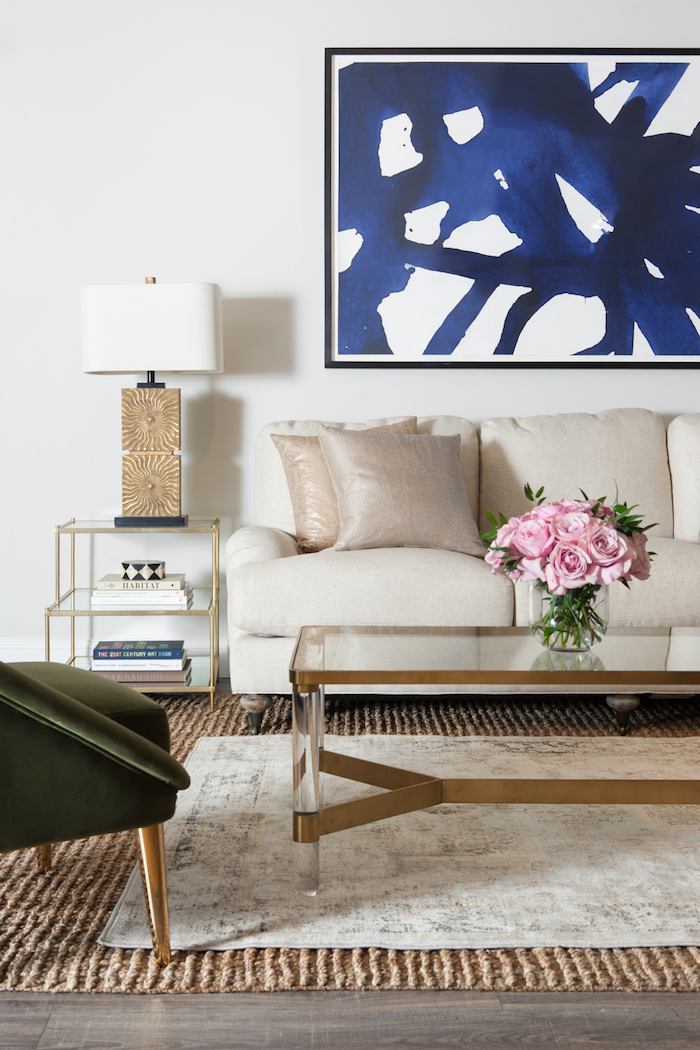
Now for the living room! Because the kitchen made such a strong statement with the black cabinetry I wanted to keep the living area furnishings neutral with a mix of materials and a punch of color for interest.
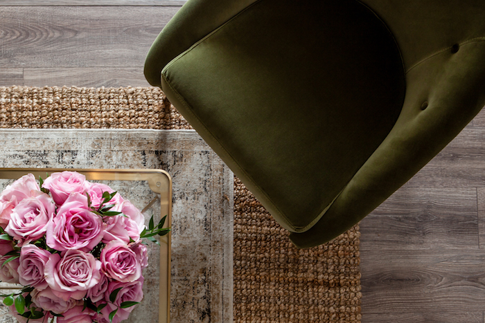
The layered rugs, linen sofa and velvet chairs bring so much texture into the space.
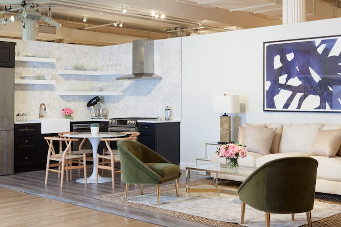
Here’s an overall shot of the room for perspective. And below are links to all items featured so you can get the look!
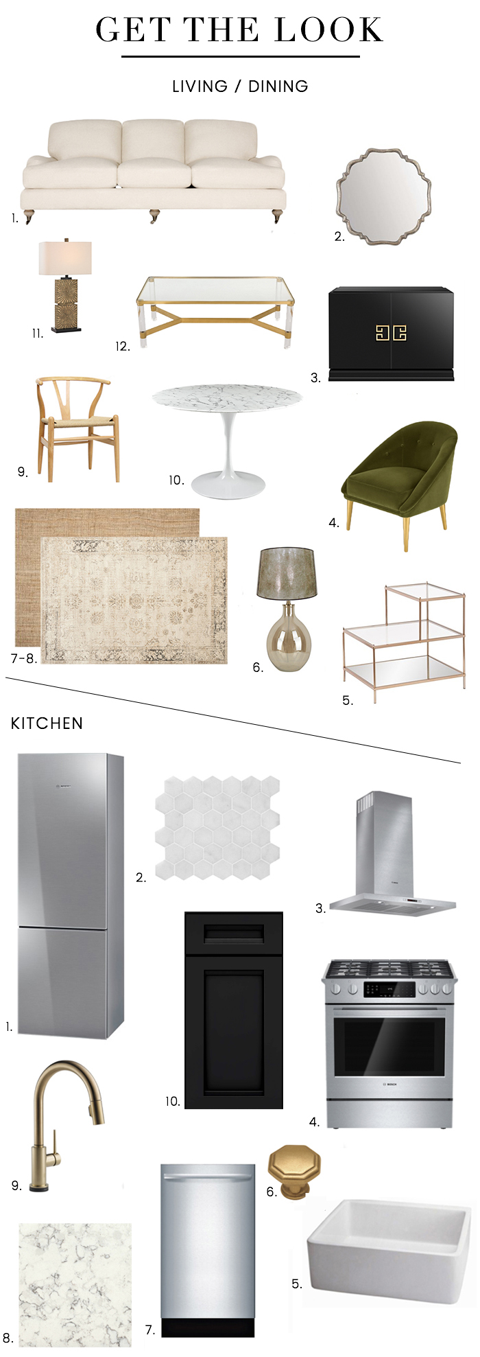
Living/Dining: 1. Sofa / 2. Mirror / 3. Cabinet / 4. Chair / 5. End Table / 6. Lamp & Shade / 7. Natural Fiber Rug / 8. Antiqued Stone Rug / 9. Dining Chair / 10. Dining Table / 11. Gold Table Lamp / 12. Coffee Table / Kitchen: 1. Bosch 800 Series Refrigerator / 2. Hex Marble Tile / 3. Bosch Range Hood / 4. Bosch 800 Series Range / 5. Farmhouse Sink / 6. Cabinet Knob / 7. Bosch 800 Series Dishwasher / 8. Silestone “Blanco Orion” Countertop / 9. Faucet / 10. Kraftmaid Sonata Cabinets in Onyx
Photos by Reid Rolls




9 Comments
Love! What is the flooring- I assume it’s also a Lowe’s product?
Hi Asheya! The flooring is this one available at Lowe’s!
http://www.lowes.com/pd_672976-35938-LF000808_0__?productId=50438242
Thank you so much! I’ve been on the hunt for a gray-ish tone and this is perfect.
Pingback: Project Tour: Inside My Room for Design on a Dime 2016! - WOONIO
Good job, Nicole! The kitchen tiles and the coffee table are amazing!
It is a beautiful work Nicole. And the purpose behind makes it all the more endearing. Stay blessed
Where did you get the white floating shelves – Just found your website! Gorgeous – already a fan!!
Hi – they are from Kraftmaid – the same company that makes the cabinetry. And thanks so much for reading!! xo
Pingback: Before & After: Inside Orange is the New Black Star Adrienne Moore’s Living Room Makeover | sohautestyle.com
looking for a coffee table i saw with your label it was leather suitcase style mirrored top and sides with chrome base very modern looking and nail heads finished the look might be a few years old. loved it!!