A lot of my clients are young families with small children so I get to work on a lot of kids spaces and it’s always so much fun! This folks, is what I have dubbed, “The Coolest Playroom In Brooklyn.” It’s a space I designed for my clients in Brooklyn last year and it truly is the go-to spot for neighborhood play dates. I wanted to dedicate a post to revealing this space and walking you through the design process while also sharing some great tips on creating the perfect, kid-friendly play space. I also included some before and afters at the end because it’s always fun to see how a room has been transformed!
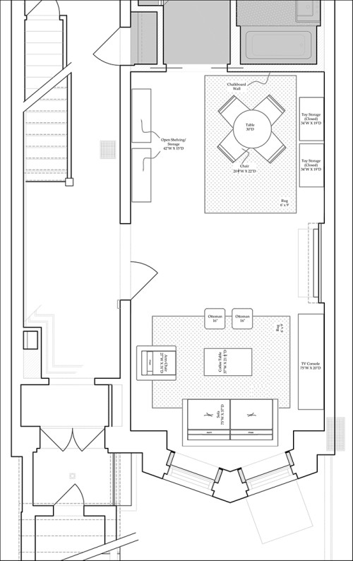
My clients wanted a large, multi-functional space with lots of storage for toys where they could host play dates and where all the mommies and nannies could congregate while the kids play. Here’s a look at the floor plan we came up with to put this in perspective. There are a couple of elements not represented here because, naturally, things always evolve during the design process. The side tables are not shown here and also, we would have preferred to orient the sofa opposite the TV console, however, there was a large HVAC vent in the floor, not shown in plan that would have posed a fire hazard if covered up. So we settled on placing the sofa in front of the window and it looks great.
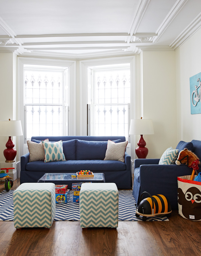
Here’s what the seating area looks like now. We grounded the space with a blue and white chevron rug from Land of Nod and chose a comfy sofa and chair from Lee Industries. The sofa is actually a pull-out bed so they have even more room for overnight guests – and it’s slipcovered. Slipcovers are always a great idea for kids spaces because if they get dirty, you can simply throw it in the wash! The navy fabric is from Kravet and we also had it teflon coated for extra stain protection which is another great tip. Teflon coating fabric makes it extra resistant to drips and spills and also helps it to clean easier. To add some contrast against all of the blue hues, we incorporated these red lamps by Mottega from Arteriors. Since the clients were moving into this big new brownstone from a much smaller apartment almost everything in the space is new but the two small ottomans were pieces we repurposed from their old place. They were originally brown leather cube ottomans from Crate & Barrel that had taken a beating but we gave them new life by reupholstering them with a chevron fabric from Duralee. I love this space so much. It’s bright and vibrant and is the prefect place for watching a movie or where the mommies can hang while the kids play across the room.
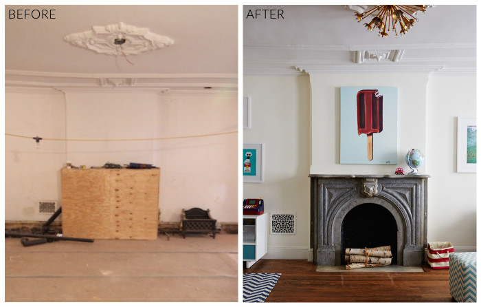
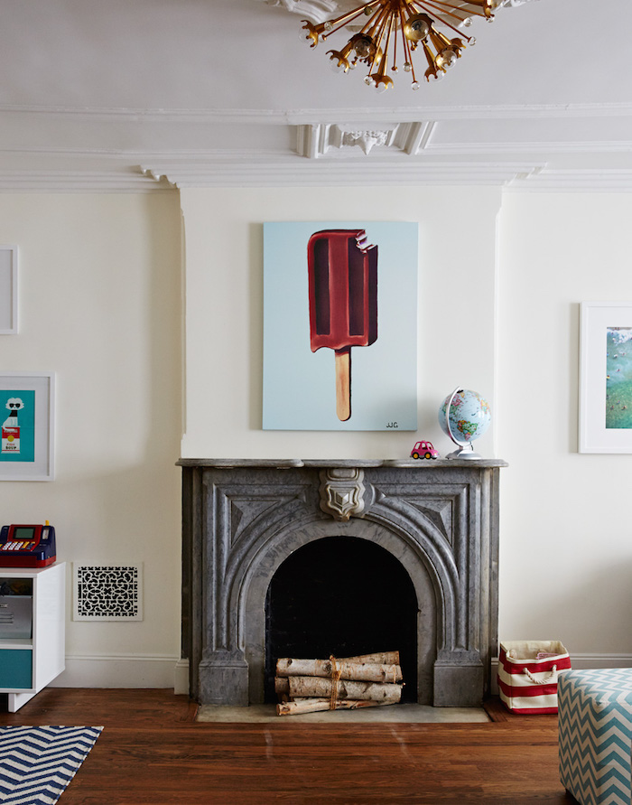
The playroom has French doors that open up into it and this is the focal point when you walk through the door. I mean, a fireplace in a playroom! So fab! We accented it with a whimsical canvas popsicle print that I found on One Kings Lane (sadly, no longer available). I think it really helps set the tone that this is the fun zone! Another important element in the room is the color palette. This space is actually the ground floor of the brownstone and despite the bright scene you see here (hello photoshoot lighting!), the room actually doesn’t get a ton of natural light so I wanted to keep the walls white to reflect as much light as possible and bring in pops of color and pattern to make it feel vibrant. The white I chose is Benjamin Moore’s Marscapone. The clients have an adorable little daughter (shown in the top photo) but were also pregnant with a baby boy at the time so another request was that the playroom feel gender neutral. We settled on a red white and navy scheme with some aquas thrown in to keep it from feeling too mature. I always like a kids space to feel sophisticated and not too childish because kids grow so fast and if a room is too kiddie-like, they’ll outgrow it quickly. So this color scheme is perfect. Just the right amount of whimsy but still a space that they can feel right at home in for many years.
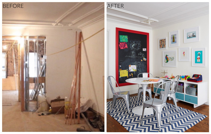
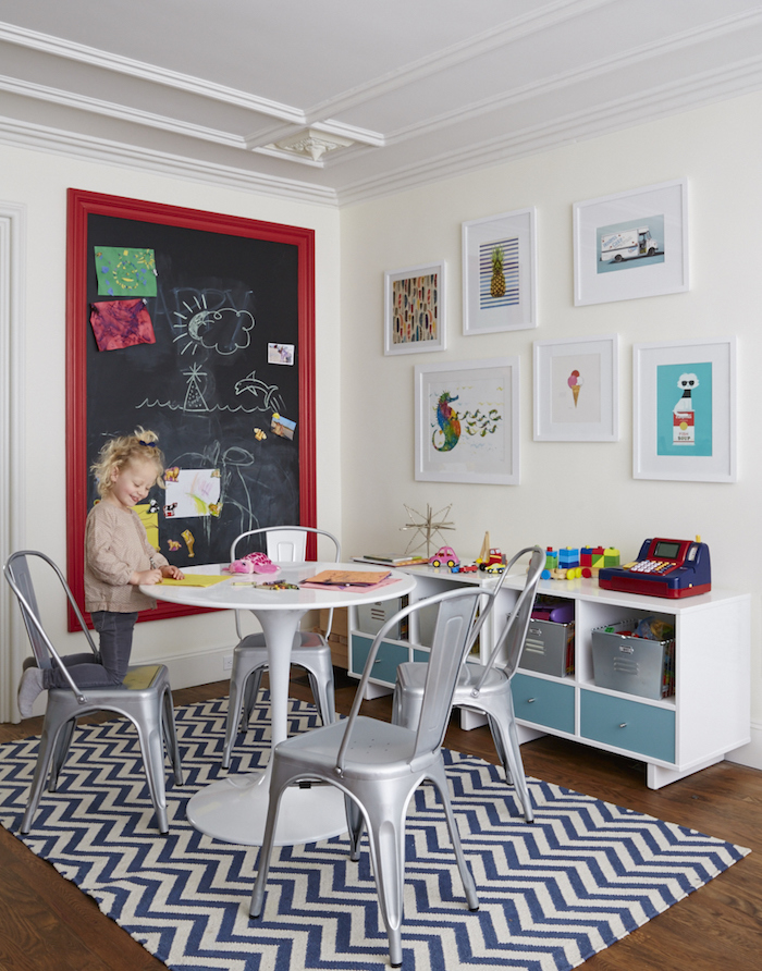
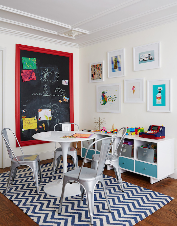
I also wanted to create different zones in within the playroom to make it multi-functional. So you’ve seen the seating area and the middle/entry of the room which is the wide open space for puppet shows and karaoke concerts, now let’s take a look at the arts and crafts zone. This colorful little nook is one of my favorite areas in the room. Rather than bring in tiny kid sized furniture, I chose an adult sized tulip table and chairs that the kids can grow into. It’s also perfect for the adults to sit and have coffee or a drink while the kids watch Frozen for the billionth time! There’s also lots of storage for arts supplies and toys in the space. The cubbies were a find from Room and Board. I also really love the chalkboard wall feature. There was lots of leftover moulding from the renovation so we used some of it to create a frame around a magnetic blackboard for a built-in look. We painted it in Benjamin Moore’s “Poppy” to make the chalkboard really pop off the wall! The gallery of art above the storage cubbies are a mix of pieces the clients already owned and a few new ones from Etsy and Art.com.
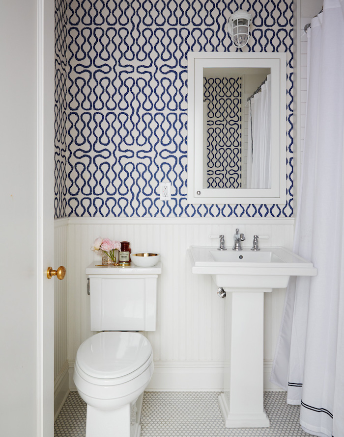
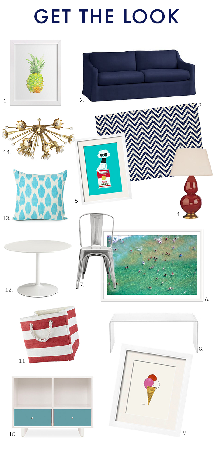
And while not exactly a part of the playroom, this is the bathroom just adjacent to it and I love the Cole & Son “Squiggle” wallpaper we added to give it personality and also tie in with the playroom’s color palette. So fun, right?! While the rest of the house was a bit more refined and higher-end, almost everything the playroom with the exception of the upholstery and pillows were purchased at retail and I’ve included many of the sources as well as similar items to get the look below. Also check out the before and after shots. The space had great bones and a lot of potential to start with but we really made it come to life by layering in the perfect mix of furnishings, color and pattern! 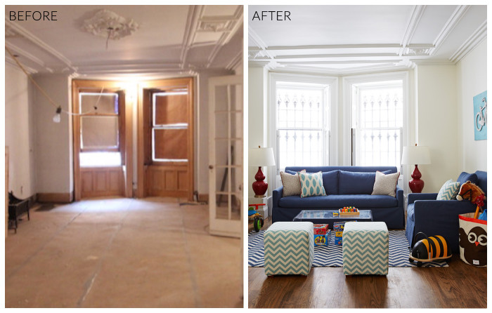
1. Watercolor Pineapple Print / 2. Slipcovered Sofa / 3. Chevron Rug / 4. Gourd Lamp / 5. Andy Warhol Cat Print / 6. Gray Malin Bondi Beach Swimmers Print / 7. Tolix Chair / 8. Acrylic Coffee Table / 9. Andy Warhol Ice Cream Print / 10. Storage Cubby / 11. Striped Storage Bin / 12. Tulip Table / 13. Ikat Pillow / 14. Sputnik Light Fixture
PS:
See the Kitchen transformation from this project here.
See the Master Bedroom transformation from this project here.
See the Laundry Room from this project here.
See more highlights from this project here.
Read about one of our favorite art sources used for this project here.



Comments are closed.