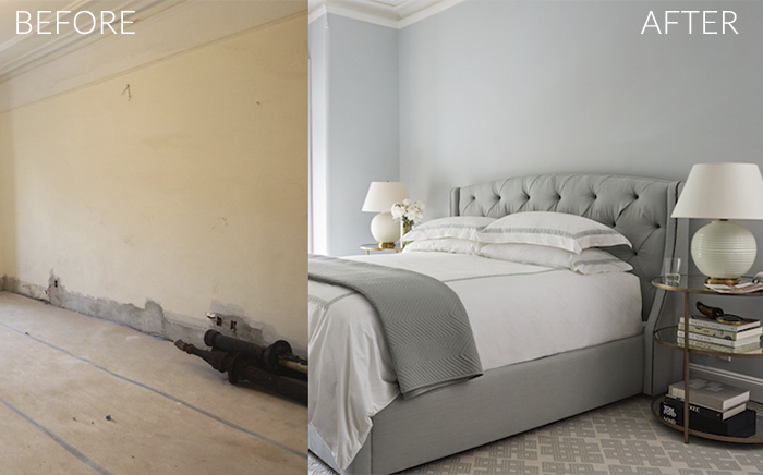
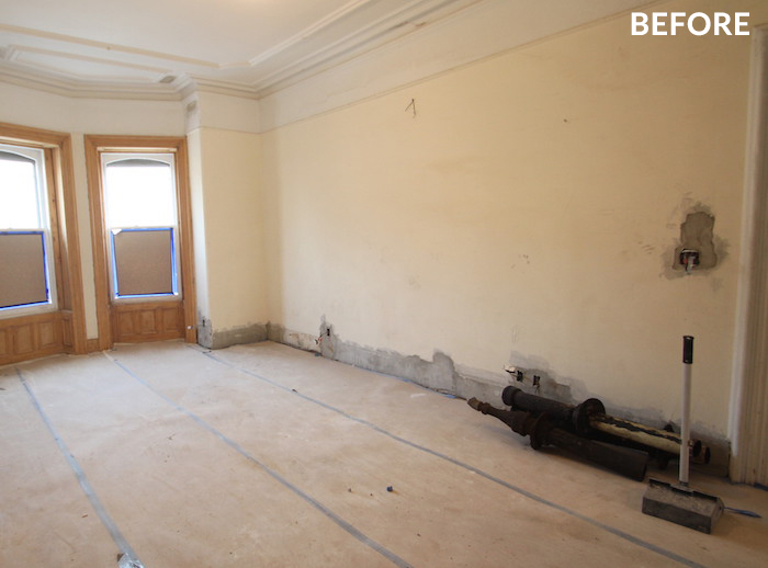
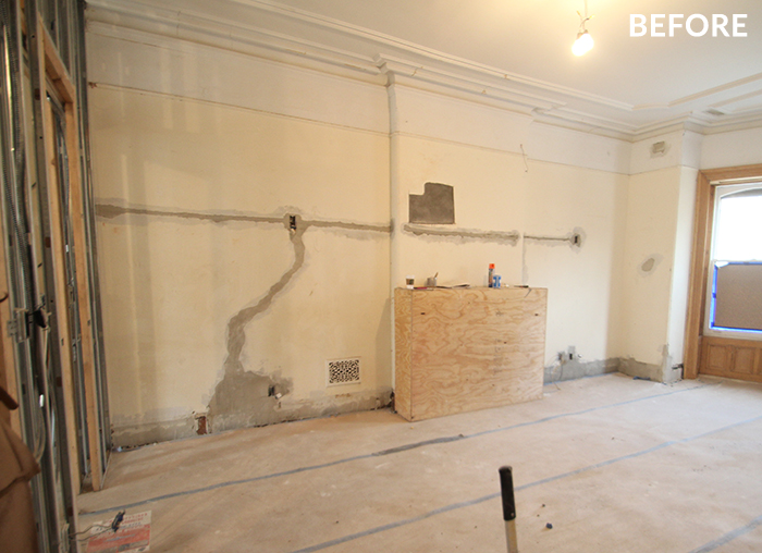
I always feel that bedrooms should be calming and serene and in the case of my #projectparkslope clients who have two small kids, I wanted to create a master bedroom that felt like a retreat from toddler central. The space has a beautiful white marble fireplace which inspired a very soft color scheme. The clients lived in an all gray apartment previously and were nervous about the idea of incorporating color into their home. Since they loved grays, I came up with this soothing blue monochromatic palette grounded in Benjamin Moore’s Cool Breeze which, depending on the light, sometimes can reads more gray. It was a nice comprimise! Scroll through for a full before and after tour. I tried to include links for as many items as I could. Let’s start off with a couple of before shots of the space during the renovation…
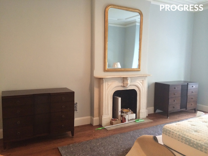
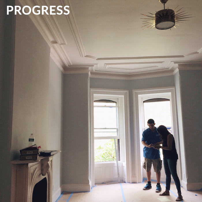
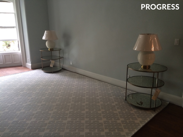
And now for the progress shots…
You can see that new baseboards were added, the picture rail underneath the crown moulding was removed and all of the millwork was restored and painted Benjamin Moore’s White Dove for a more clean and modern look. We added a beautiful light fixture from Circa Lighting which isn’t visible in the final shots. You can find it here. And now for the final room reveal….
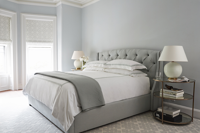
This master bedroom is such a breath of fresh air! The tufted bed from Bernhardt covered in a Fabricut linen adds an air of romance to the room. I especially love the rug from Stark which adds lots of texture plus the geometric pattern lends a bit of edge to the soft, feminine space and helps break up the tonal palette a bit.
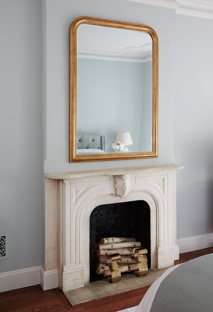
I also added this oversized Louis Philippe inspired gold leaf mirror from Made Goods which mimics the silhouette of the fireplace. The andirons are from Arteriors.
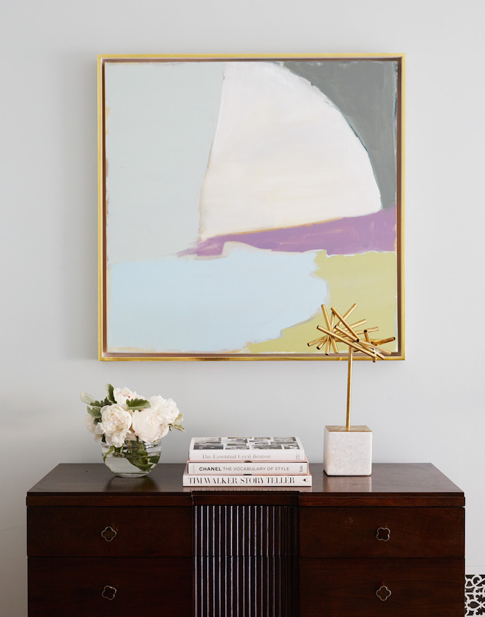
I found this beautiful abstract painting from an artist I discovered through Saatchi Art named Mary Elizabeth Peterson. Her work is so bold and graphic and the colors of this piece really compliment the room. I added a simple gold leaf floater frame to give it an even more elevated look. Additional credits: Dresser / Sculpture
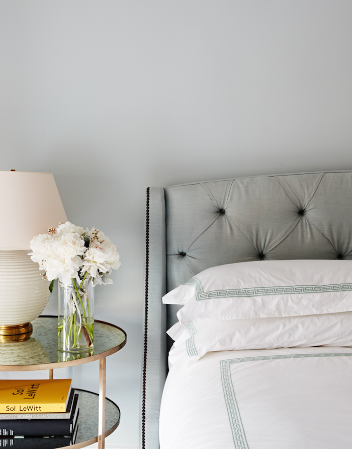
I always use crisp white bedding in design projects. It makes every bedroom feel like a luxury 5-start hotel. You can find this greek key duvet & sheet set here. Additional credits: Mirrored Side Table / Lamp / After photos by David Land
As many of the items featured in this space were trade only, here are some similar ways you can get the look for less:






9 Comments
Hi Nicole,
Fabulous job! What an architectural gem that you brought back to life! Love the color! In fact, just specified it for a client’s bedroom after exploring every shade of blue, green gray in both BM fan major fan decks and F&B. She loves the color stories palette. Less choice. There’s a lesson there, because do we really need 5,000 colors? [some of them should be outlawed in any case. haha!]
I really like the decision to take down the picture rail moulding. It was stopping the eye from moving up to take in the magnificent crown and ceiling detailing. best, Laurel
I really like all the ceiling molding. And the rug is nice too. Have a great weekend!
Love the side tables. I agree about white linens. I ONLY sleep on white linens and my sisters laugh at me. They can laugh all they want. White makes a room look fresh. I’m loving your designs of this house. Will we see more?
This is a lovely transformation, Nicole. On behalf of everyone at B E R N H A R D T, we are proud to be among your resources as you create these beautiful interiors. Wishing you, and your clients, joy and comfort! Much continuing success..
Absolutely stunning!
White really does brighten up a room. It gives off a cleaner feel. The room looks great!
Pingback: Art We Heart: Mary Elizabeth Peterson | sohautestyle.com
Pingback: Before & After: Brooklyn Brownstone Kitchen Renovation | sohautestyle.com
Pingback: Nicole Gibbons Studio Project: The Coolest Playroom In Brooklyn | sohautestyle.com