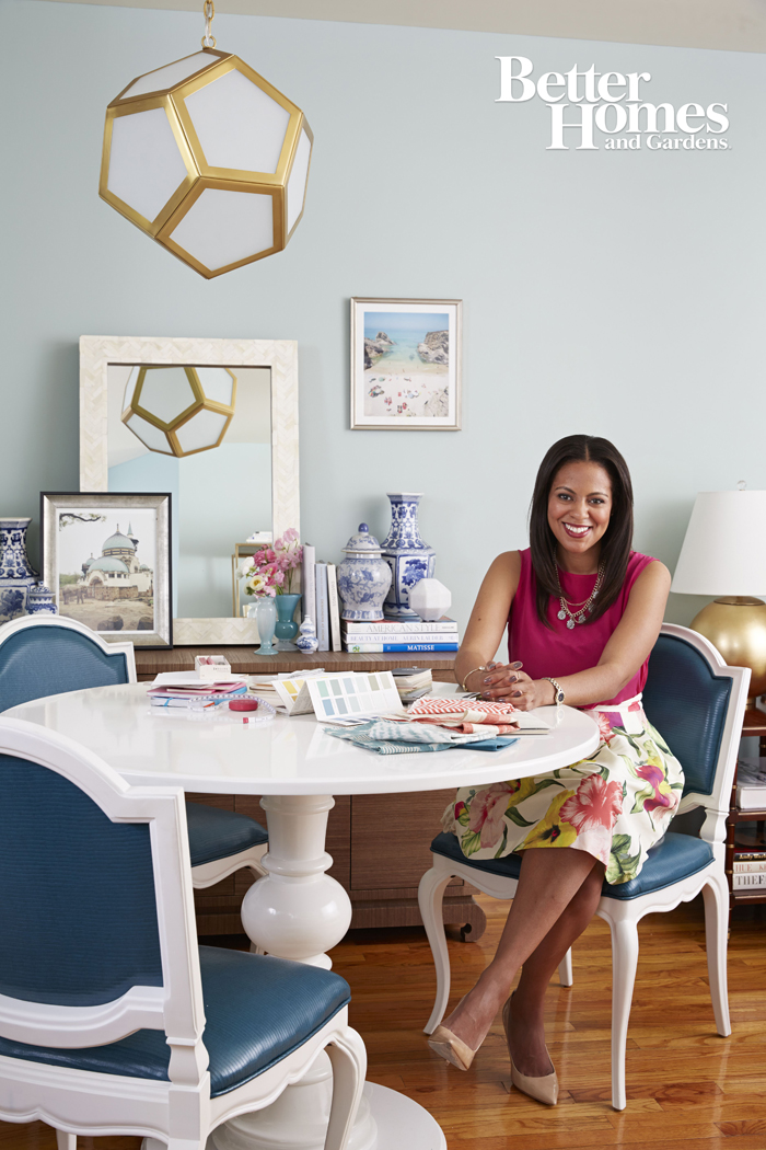
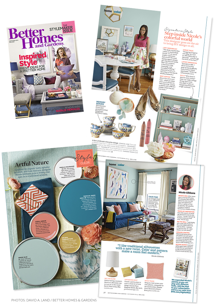
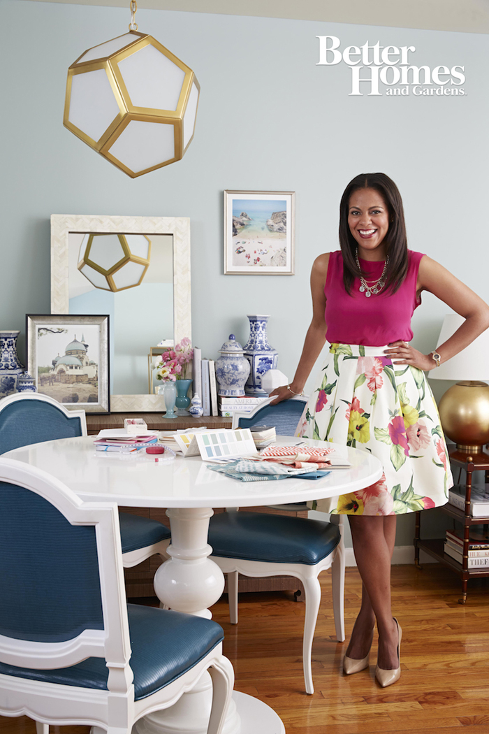
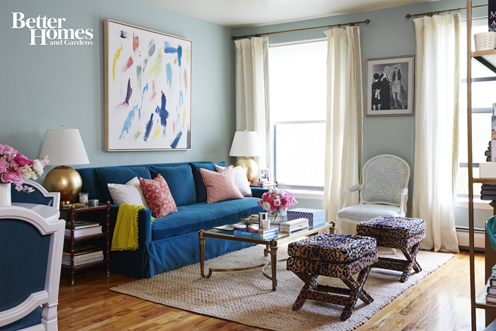
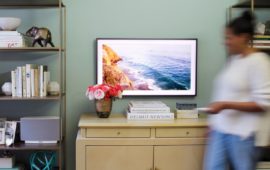
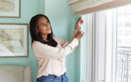
The September issue of Better Homes & Gardens just hit newsstands and guess what?! I’m in it! It’s the magazine’s annual Stylemaker issue there is a 3 page story on me, my apartment and my tips and tricks for decorating with color! A while back I told you that I was redecorating and gave you a little sneak peek and I’m so excited to share these photos of the finished space from BHG! Being a part of the BHG Stylemaker issue is a kind of a big deal since it focuses specifically on influential personalities that are making their mark in world of all thing home. Thank you to the BHG team for the huge honor and thanks also to the uber talented photographer David Land, hair and makeup artist Ananda Kahn and stylist Natasha Louise King for lending your artistic vision to help make this shoot a success! Below are some snapshots from the story. Be sure to pick up a copy on newsstands now or download the digital edition which features a cool interactive color tool that let’s you play around with the color palette from my home by changing the color of my walls. There’s also a feature where you can design your own room using colors and fabrics inspired by my living room. It’s very cool. And in the coming weeks, be sure to check back on the blog I’ll be sharing multiple posts with more details on my space including before and afters, DIY projects and more. Stay tuned!




26 Comments
The royal blue couch really makes the entire room come together. You did a fantastic job!
Thank you Michelle!
Congratulations Nicole!!! You did a fantastic job. I have been following your blog for years and never posted before but felt compelled to this time…simply amazing!
Cle – I thank you so much for following along in my journey and I really appreciate your kind words!!! xoxo
Wanted to add a few comments if I may….Would love to see your sofa floating in the room facing the windows – everything is pushed up against the wall, which makes the space feel smaller and so predictable. Also, think of adding roman shades with some trim detail to soften the windows and add a few layers…. A larger rug would anchor the furniture layout and provide an opportunity to better divide living and dining areas. Love the styling and great colors.
Thanks so much for the comment! The seating is designed for entertaining and there is a lot you don’t see in the photo to inform your judgement – like the open kitchen with island adjacent to the dining area and – the space is actually much smaller than it appears in the photo. Typical NYC living:-) While in theory, it would be nice to face the window and take in the veiw while relaxing, it would then close off the seating area to the rest of the room when entertaining and it would virtually chop the room in half, eliminating all flow and making the room feel cluttered (trust me, I’ve lived here for years and tried every possible layout!). So while perhaps a little predictable, it’s the arrangement that makes the room feel the most open and is also the best suited for entertaining. Appreciate the suggestions though!
Congratulations Nicole! I absolutely love this space and your fabulous use of color. I adore this color combo so much.:)
Thank you so much for the kind words! I was excited to try something different with this color palette and am glad to hear yo like it!
Congratulations Nicole! Your newly styled apartment looks amazing. So happy for you and thanks for featuring this for your blog readers:-)
Thank you Tamara! I appreciate the kind words!
I love it! It looks great! I am going to go & grab a copy today.
Thank you so much for the support! And there are many more great stories in that issue! It’s a good one:-)
Loved the Artful Nature Color Palette – It’s been a favorite thru many of my projects!
Probably gonna do a shout out on my FB page next week! Will be sure to start following your blog!
Thank you so much for the shout out on your FB page and for following!
Congrats on the BHG feature. Your home is beautiful. I love the blue sofa!
Thank you Kailani! I appreciate it very much! Thanks for reading!
Congratulations! I saw this article some days ago and then remembered your blog. Your place looks refreshed and I love what you did with the etageres! They came out really pretty.
Pg 55of the Sept. Better homes & gardens issue – can you supply info on the large lt. turquoise coloured background fabric on this page ie type of material and supplier. I’m hoping to find something similar for some club chair slipcovers. Thanks, enjoyed the article.
Oh Nicole, It looks lovely, I’ve been a fan of Your apartment for a while:) When I looked at photos of Your leaving room I felt calm:) The new reveal is so lovely too:) Since I really love te ocean and the sea and also need to feel calm and serene at my home I love the light blue colors myself, please would You be so kind and tell me what color,paint is that on Your walls?
Late to the party, as usual. Just wanted to say, someone gave me a subscription to BHG and so far, I’ve gotten 6 issues and never even took them out of the plastic. They are all in the basket I keep by my bed with magazines I plan to read eventually. I will now search through for this issue. I’ve always loved your apartment and I ADORE the blue (my fav color). This looks beautiful.
Thank you so much @mslewis! It means a lot!
You might remember me as a contest winner when your site started. I am still here supporting and watching you rise. Love the redecorating. Is that a slipcover on sofa or a new sofa? The sky’s the limit for you. Move over Martha!
Nicole – LOVE your blog, your decor and what you did with Elaine’s apt (small world – I know her well). I wanted to ask where you found the white lacquer table in your dining room? I’ve been looking for the perfect one and love the base on yours. Thanks in advance!
Hi Daria! Thanks so much for the kind words! The table is a custom piece from Dunes & Duchess: http://www.dunesandduchess.com/
Pingback: Vintage Chair Before and After | sohautestyle.com
Pingback: DIY Gold Bookcase Etagere | sohautestyle.com