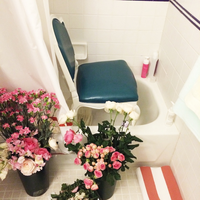
Well hello there! You may have noticed a bit of radio silence here on the blog lately and it’s because I’ve been busy busy busy! In addition to working on design projects for clients in and around Manhattan, I’ve been back and forth to LA for other business, working on some exciting brand building initiatives and even more exciting, I’ve been redecorating! Well I guess I should say I redecorated because I’ve mostly wrapped things up and have already prepped and executed two photoshoots at my place! I’m pleased to share that my apartment will be featured in an upcoming issue of Better Homes & Gardens and on one of my favorite Hearst magazine websites! It’s been a whirlwind couple of months! Above is a shot I posted on Instagram earlier this month on the day of the BHG shoot. When you have an entire photo crew in a 600 square foot one bedroom apartment, bathtubs come in handy for extra storage! Since I can’t reveal the apartment pictures just yet, I thought I’d give you a little sneak peek at what’s to come and some insight into why I’ve decided to change things up in my little rental.
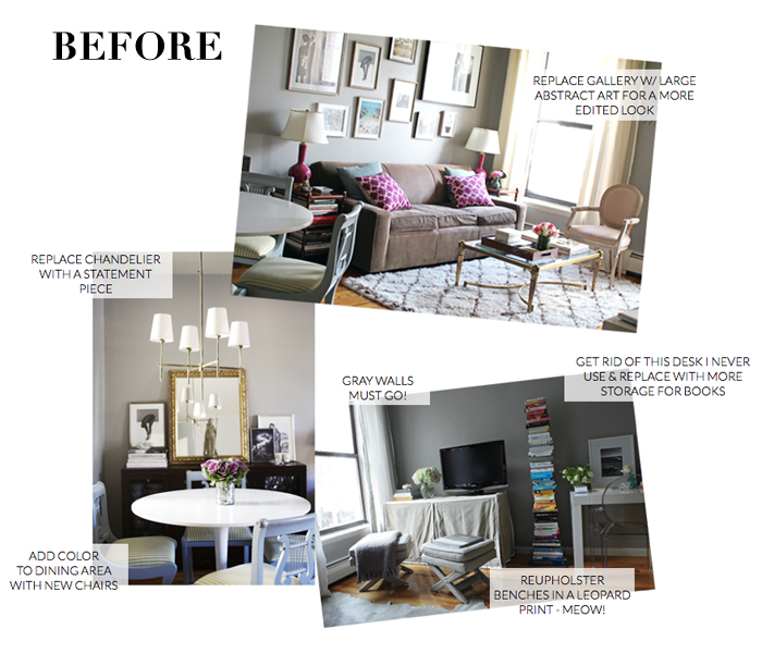
This is what you may remember my place looking like previously. It had been this way for several years and over time I grew bored with the look. Also, those gray walls that I once loved were were starting to feel so dark and boxed in to the point where I hated being home. That’s when I decided it was time for a change. I considered moving into a new apartment but ultimately I’d like to make a permanent move to the west coast sooner than later and I didn’t see much point in going through the hassle and expense of moving in NYC so I decided to stay put an redecorate. Since I’m always out in the market checking out the latest in home, I already had ideas for what furniture, colors and fabrics I wanted to incorporate into the space. And in terms of functionality, the goal was to make the room feel less cluttered and more edited. The space was overflowing with books that needed better organization and I wanted to replace the eclectic gallery wall with a single statement piece to help make the room feel more calm.
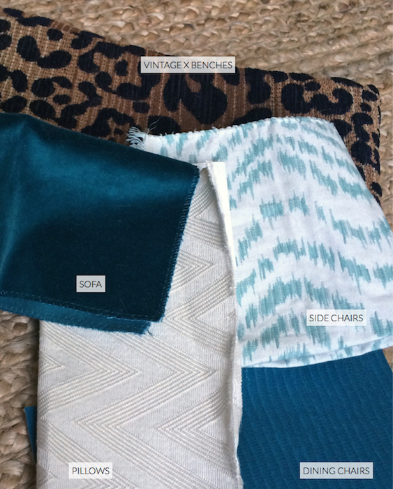
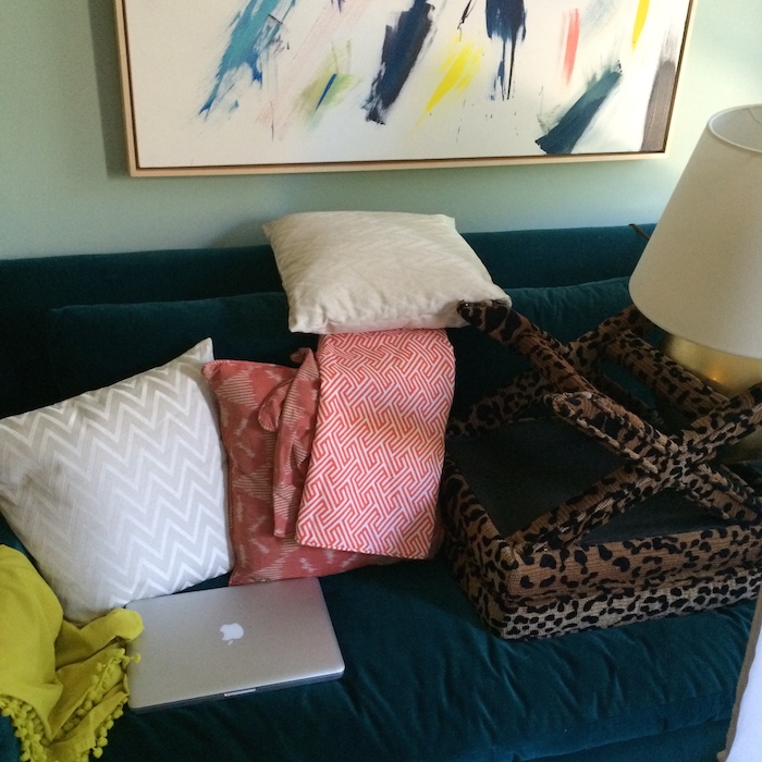
Here is a peek at some of the fabrics you’ll soon see in the space! I wanted to incorporate rich textures into the room since the space is just a boxy rental lacking in architecture.
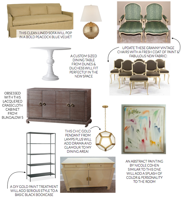
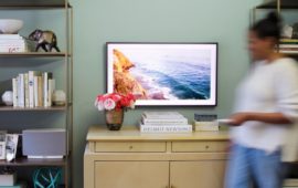
And here is a look at some of the new furniture and accessories. The only items that remain from the previous look are my coffee table, end tables and x benches which I’ve reupholstered in a fabulous leopard print! I love a neo-traditional look and the mix of new and vintage you see here as well as the prints and color palette (more on that later!) definitely reflect that. One of the items I’m most obsessed with is a painting made for me by my friend Nicole Cohen of Sketch 42! It adds so much color and personality to the room!
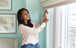
Here is a little glimpse behind-the-scenes of the chaos during the big photoshoot. As you can see there is lots of color! That’s all I can share for now but stay tuned for more details including before & afters of some of my furniture projects and a full house tour coming soon!
Sofa / Lamp / Cabinet / Painting / Pendant / Dining table / Bookcase
Dining chairs, Side chairs & lacquer cabinet are vintage




7 Comments
Love it!! Your new look has a lot of the same elements that I have in my apartment– navy couch, abstract art, gold etagere… love. Next on my list are Louis XVI chairs and a small round table.
Hi Nicole. Would you mind sharing the source for your leopard fabric for the x benches. I have a slipper chair that I need it for. Thanks!
Hi Donna – it is fro Duralee!
Nicole,
I have been looking for a coffee table that is gold and glass just like the one you have in your apartment. I also see it in the photo above.
Please, can you tell me where you found it? I hope it is somewhere that I can find one too.
Hi Janice! Thank you so much! It is from eBay!
Hi Nicole,
I love your new apartment colors. I saw it in Better Homes and Gardens September 2014 issue.
Please tell me where you found your gold and glass sofa table? I love it. Your style is amazing!
You sure did a lot of work in your place. But it’s good that you know what you really want to do on the redecoration project. Change is good once in a while; it proves that you are innovative and creative. I like all those home decors you used for the room’s new look. I can’t wait for the before and after photos!