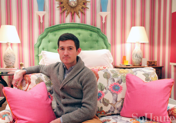
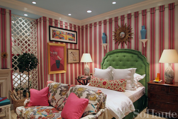
I’ve been a huge fan of designer Nick Olsen since his apartment was featured on the cover of Domino in 2006. Back then he was still assistant extraordinaire to Miles Redd as well as Domino’s resident blogger aka “the Deal Hunter.” Since those days, the supremely talented Nick has struck out on his own and is currently on the rise to design stardom. His work has garnered awards and has been featured on the pages of prestigious titles like Veranda, House Beautiful, Trad Home and many more. Recently, Olsen was tapped to collaborate with Lee Jofa, to decorate their Designer Showcase Room inside their showroom at the D&D building. The room is changed over just twice per year and Nick is also one of only two designers to decorate the space who do not have an existing fabric collection with Lee Jofa, so needless to say, this is a huge honor. I caught up with Nick at Lee Jofa earlier this week to get the scoop on his bedroom space and to hear all about what he’s up to these days. Nick describes his room as “preppy decorating in technicolor” and says he wanted to create a colorful space to brighten up spirits during these dog days of winter. He started with the pink striped GP & J Baker fabric as the foundation which he used to upholster the walls which he accented with bold kelly green and turquoise hues combined with floral and suzani prints for an eclectic mix. The result, Nick says, is “happy, feminine and cheerful, but not too grandma!” Have a look at the photos below to see all the details of this fabulous space!
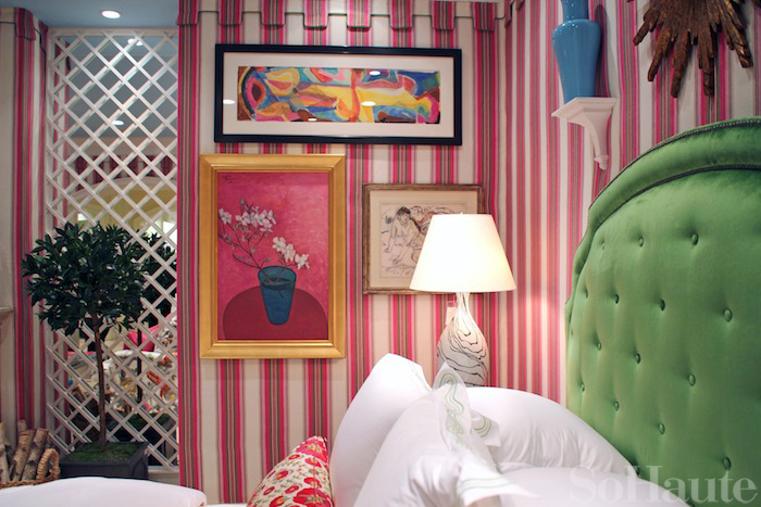
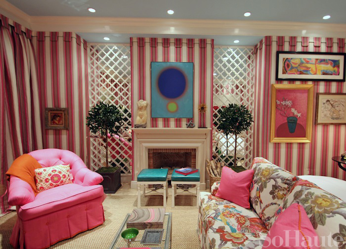
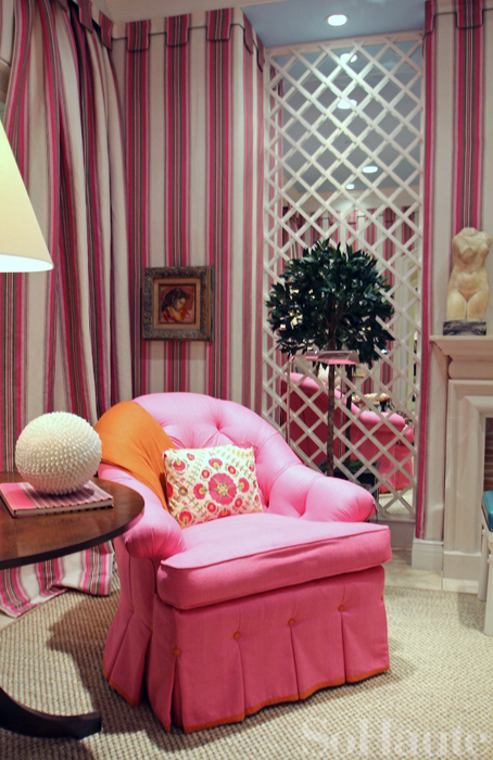
The starting point of inspiration for Nick’s design was the “Paxton Stripe” fabric in pink from GP&J Baker which he used to upholster the wals. I just love the chic greek key valance detail at the top.
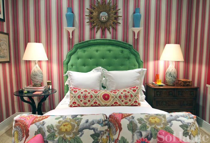
Nick accented his bed with crisp white bedding from Schweitzer Linen. The artwork on the walls were borrowed from the Spanierman gallery.
The headboard Nick used in his design is the Ariel headboard from Kravet, which is Lee Jofa’s sister company. It’s upholstered in a kelly green velvet from Lee Jofa. The table on the left is the Lucille table in ebony from Holland & Co. On the right is a traditional bachelor’s chest and the pair of lamps are from Bunny Williams Home, available through Lee Jofa. The bold suzani fabric used on the pillow is called Ayla Trellis from GP&J Baker.
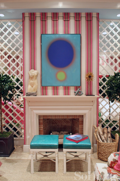
One of my favorite features in Nick’s space is the mirrored trellis on either side of the mantle. It adds such dimension to the space. I also love the addition of the topiaries which are on loan from Trelliage.
I love the way nick’s brilliant use of color makes traditional furnishings feel completely young and fresh. The punchy turquoise colors of the painting and the pair of benches here really make the room pop. The bench is from MacRae and is covered in a leather from Kravet.
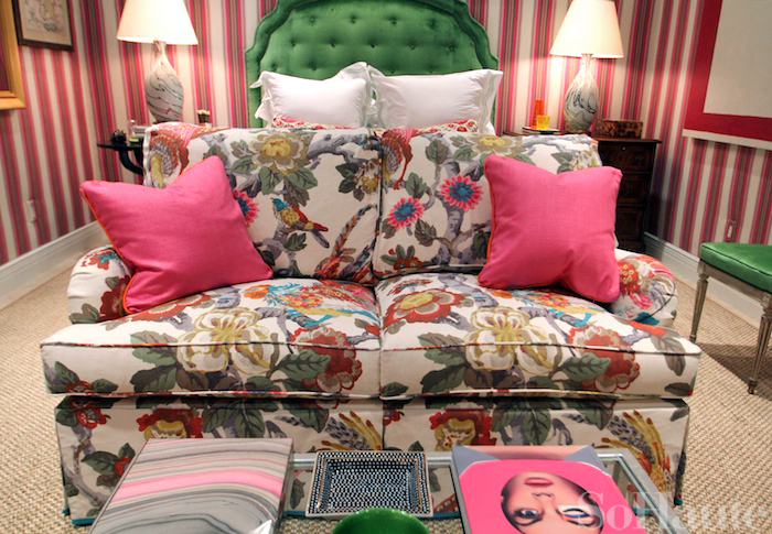
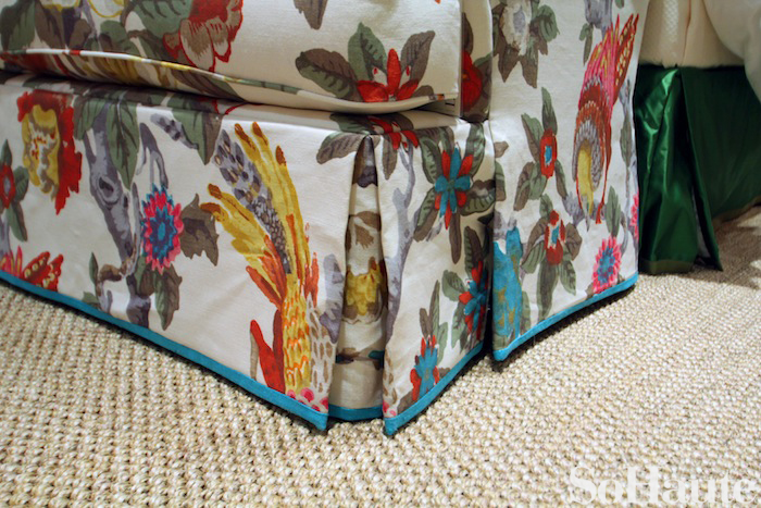
Nick was really inspired by the colors of this floral fabric called Pertelote from GP&J Baker. Nick took the colors from this bold floral and used them to dictate the color choices for the rest of the room.
The tufted Adler chair seen here is covered in an ultra bright pink silk from Lily Pulitzer called Rip Roaring Hibiscus. It is also seen on the pillows that adorn the sofa.
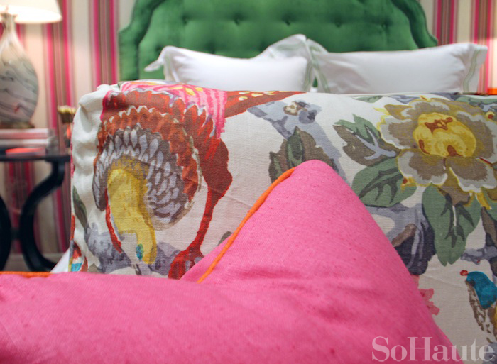
Here is a close-up of the detail on the fabrics. The bright orange contrasting welting is Rip Roaring Orange from Lily Pulitzer and matches back to the orange colors in the floral fabric.
I always say that good design is in the details and Nick certainly pays close attention to detail in his work. The bold, Rip Roaring Lagoon band at the bottom of the sofa’s waterfall skirt is the perfect finishing touch!





4 Comments
Any idea where I could get that little sunburst seen on the mantel? Thanks!
I love color and pattern but it looks like Nick’s taste in too much of both has followed him from his days with Miles Redd. Way too much of a good thing. I do love that shade of pink on that chair.
Just got back from the showroom launch. The room looked fabulous. Although pink is not my go-to color the room was very attractive. The blue ceiling was a nice detail!
not sure how we missed this post! love nick obviously…the room was perfection (no surprise!) thanks for posting a lot of the behind the scenes info. xx S&A