One of the most anticipated events in the design industry is the annual Kips Bay Decorator Show House which is a must-see event in New York that showcases the work of America’s top interior designers to benefit the Kips Bay Boys & Girls Club. The event began in 1973 after a group of enthusiastic women on the fundraising committee up with the idea as a way to raise much-needed funds for the organization’s after-school programs. Now in its 40th year, this annual event has become one of the most prestigious decorator show houses and has helped raise more than $17 million! Earlier this week I had a chance to check out this year’s show house and it is BEYOND! Usually, the event takes place inside a sprawling Manhattan townhouse but this year’s show house occupies two adjacent duplex residences at The Aldyn – a modern, luxury high rise overlooking the Hudson River. The two spectacular residences on view are currently listed for $15.9M and $16.9M and boast six bedrooms, panoramic views of the city, private swimming pools, terraces and more. The 31 decorators who participated in this year’s show house truly worked magic to transform the white boxy rooms into beautifully adorned living spaces. There was so much great design under one roof and I’m excited to share some of the highlights. So without further ado, here is a look at some of my favorite rooms…
Foyer by Bryant Keller Interiors
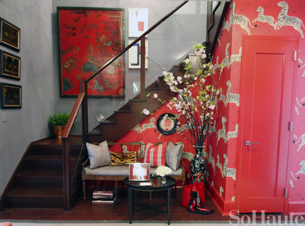
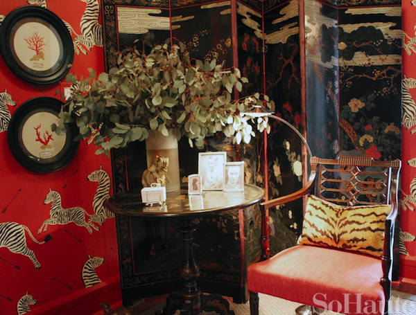
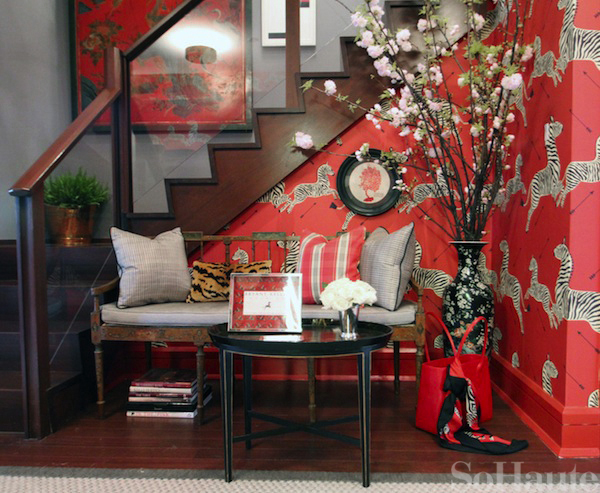
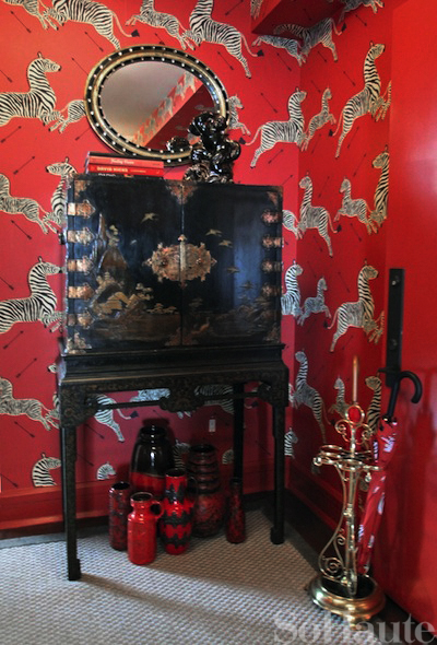
This bold foyer was the very first room I saw on when I walked into the show house and I loved every inch of this tiny space. I don’t think I’ll ever tire of seeing Scalamandre’s leaping zebra wallpaper! And having such a vibrant, energetic color greet me when I walked through the door made me even more excited to see the rest of the home.
I really loved the juxtaposition of the traditional Chinoiserie pieces, like this 17th century coromandel screen, against the whimsical zebra wallpaper. It’s a pairing that takes guts and talent to pull off and Bryant Keller combined all of these elements so beautifully.
Bedroom by Alexa Hampton
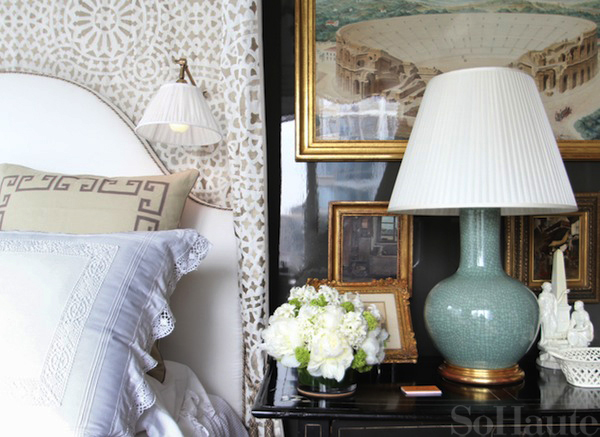
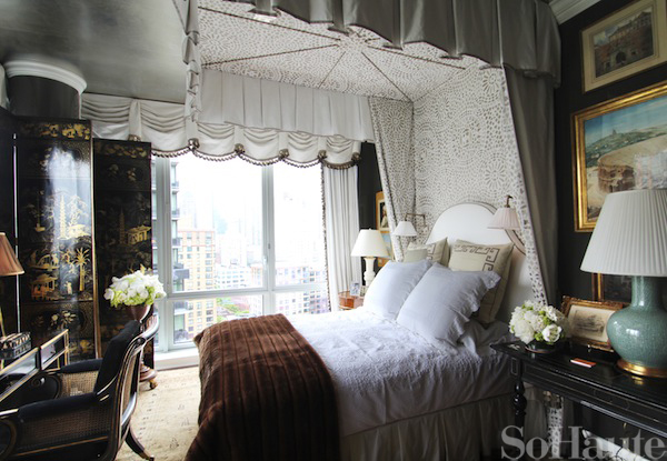
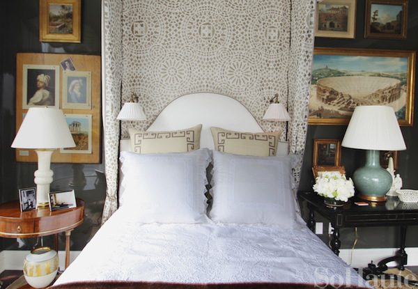
I saw designer Alexa Hampton at the opening night for Kips Bay and joked that I might have to hide in the closet and become a squatter in her beautiful bedroom! I seriously want to live here!
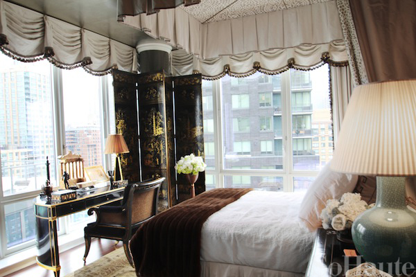
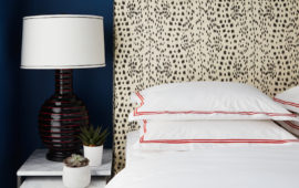
One of my favorite elements of the space are the charcoal lacquered walls, which added a modern touch to the space, and the silver ceiling. Alexa showcased her own fabric line from Kravet for the bed’s canopy. You can’t tell from the photos but the linen fabric has the most beautifully textured embroidery. The pattern is called “Meadowmere.”
Another highlight of this space are the beautiful views of the city as you can see through the windows. Alexa says her favorite Kips Bay room designed by her late father, the legendary Mark Hampton, was a chocolate brown library with white upholstery and that space served as an inspiration for her color choices here.
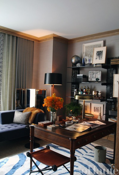
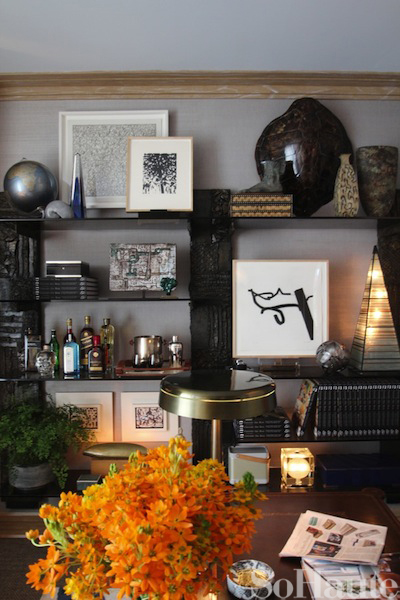
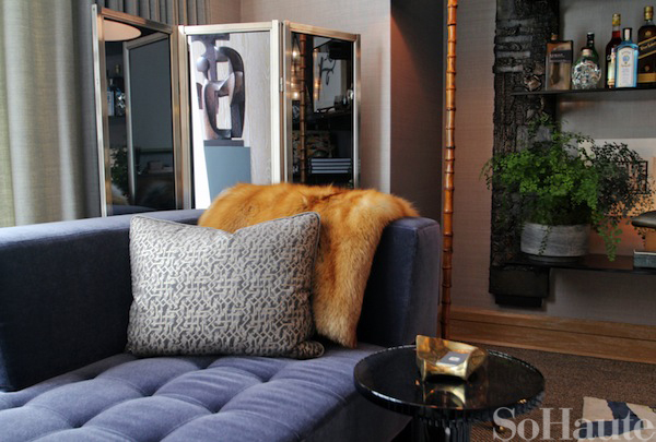
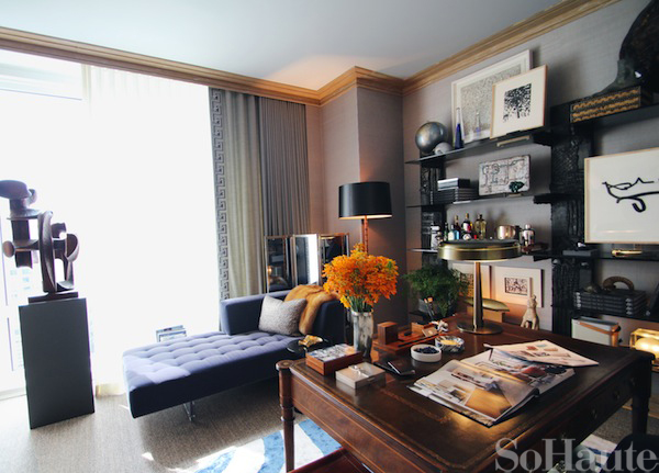
Gentleman’s Study by David Scott
Designer David Scott created a handsome gentleman’s study that was all about a play on texture. From the Holland & Sherry grasscloth wall covering to the velvet mohair chaise and silk rug, the beautifully disparate textures really helped bring this space to life.
Designer David Scott
Gallery by Thom Filicia
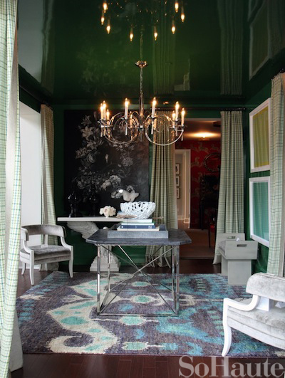
Designer Thom Filicia designed a chic gallery which serves as a pass through space that connects to the living room, dining room and library. Like Alexa Hampton, Thom also decided on a high gloss lacquer for the walls except his choice was a bold green color from Benjamin Moore. Many of the furnishings and accessories in his space, including the “Purple Haze” rug, are from Thom’s home collections for Vanguard and Safavieh and the fabrics are from his collection for Kravet.
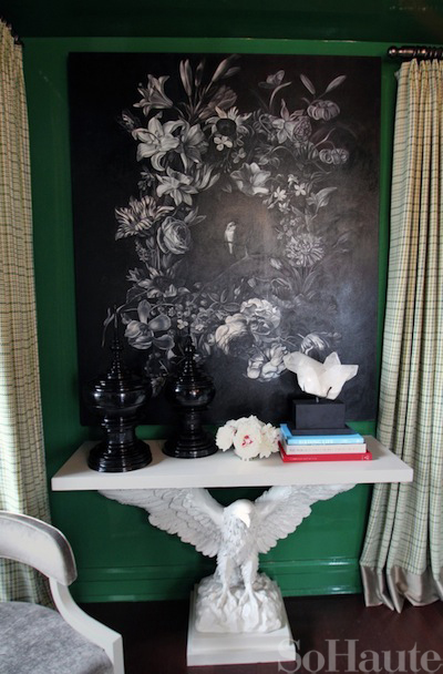
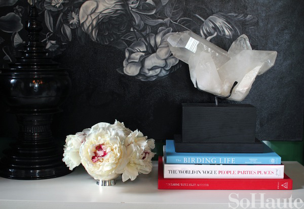
This Eagle console is a signature piece from the Thom Filicia Home collection and he uses it in all of his projects.
Study by Brian Del Toro
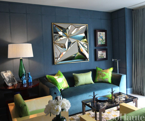
I love that so many of the designers made such bold color choices at Kip’s Bay this year. In this study, Brian del Toro chose a palette of teal with apple green accents. So many of the designers chose shades of green for their rooms which I’m told was mere coincidence. Another commonality among many of the rooms is the use of panelling, like Brian used on the walls here, to help give the boxy, uber modern rooms some architecture.
Dining Room by Todd Alexander Romano
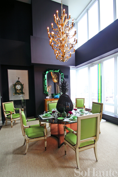
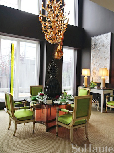
At first, Todd Romano says he was daunted by this room which has sky high 21 foot ceilings, but after his vision clicked, he went to work on his space, painting the walls aubergine and bringing in a wonderful selection of furnishings that includes a set of apple green French directoire arm chairs, a venetian murano amber glass chandelier, large scale works of art and many other amazing pieces. For a touch of whimsy, he added a large brass giraffe bust by the sculptor Sergio Bustamante.
A Collectors Bedroom by Alexander Doherty
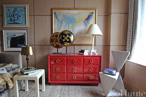
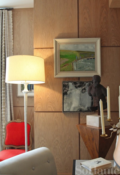
I wasn’t familiar with Alexander Doherty before this year’s show house but now I will certainly be paying attention to his work. I love what he did in this “collectors bedroom,” especially the addition of the cerused oak paneling to give the space warmth and architecture. He also incorporated a really great mix of furnishings, textures and artwork. I love the bold pop of color from this lacquered mid-century Robsjohn Gibbons commode.
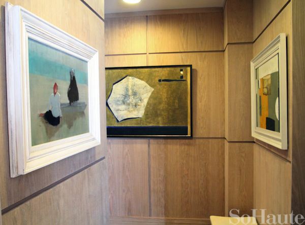
Alexander also brought in an impressive selection of paintings for his space, mostly from private collections.
This photo shows the hallway leading into Alexander’s room…he left no detail untouched!
Kitchen by Robert Schwartz & Karen Williams for St. Charles
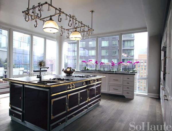
I would kill for a kitchen as fabulous as the one Robert Schwartz and Karen Wiliams designed for St. Charles. I’ve always lusted after the beautiful (and uber expensive) La Cornue ranges but who knew they made entire kitchen islands! Everything in this kitchen was an exceptional choice from the gorgeous La Cornue island and St. Charles custom cabinetry to the Miele Refrigerator and all of the well chosen, fixtures, finishes and hardware.
Le Bureau Privé (The Private Office) by Raji Radhakrishnan
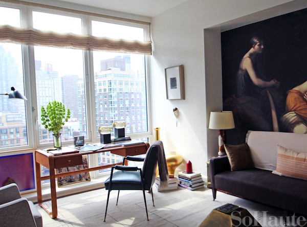
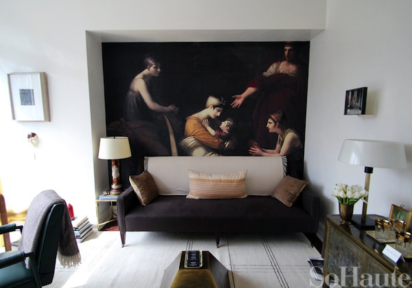
When Raji was designing her space for Kip’s Bay she wanted to develop a personality to serve as a muse and so her blank canvas became a private office designed for a curator at the Met. This artful space is so beautifully composed and she really took a thoughtful approach in her work here.
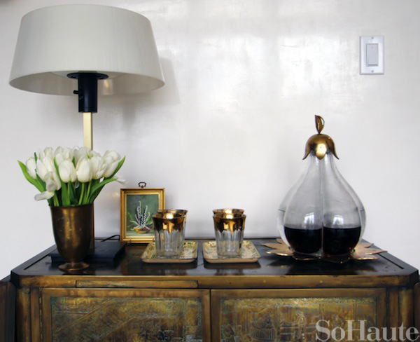
One of the most elaborate elements of her space are the venetian plaster walls which were polished to a very high shine. The photos don’t do it justice but these walls are incredible! Raji says it took 2 and a half weeks to achieve the beautiful finish that you see.
The art installation behind the George Smith sofa is actually a photo that Raji took herself at the Met and had blown up to create the mural that you see. The “Casablanca” striped pillow on the sofa is from D. Bryant Archie who makes the most beautifully handcrafted textiles.
Library by Jamie Drake
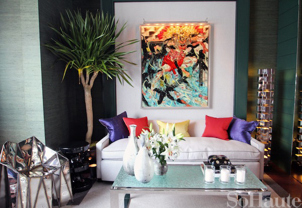
You can always expect a brilliant display of color in a Jamie Drake room and this library no exception! He chose a seafoam green grasscloth from Donghia for the walls, and covered the sofa in an array of red, purple and yellow pillows that coordinate with the large Andy Harper painting above the sofa.
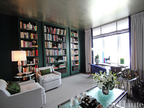
On the opposite side of the room are custom built-in wall panels and bookcases painted in a deep green color from Benjamin Moore.
Bedroom by Lynne Scalo Design
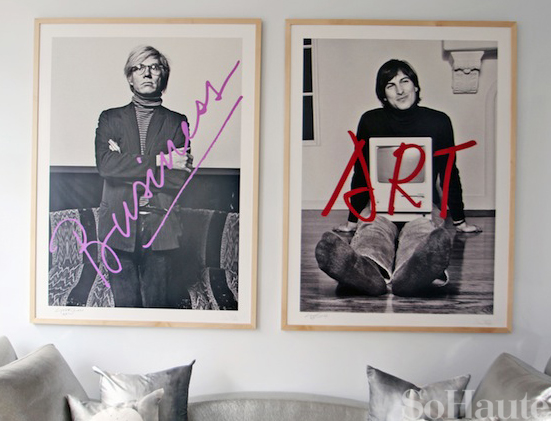
I didn’t take many photos of Lynne Scalo’s bedroom but I did manage to snap the artwork above the sofa which Lynne created in collaboration with photographer Norman Seeff. It features portraits of Steve Jobs and Andy Warhol and symbolizes both the artistic vision and commercial success of thee two icons.
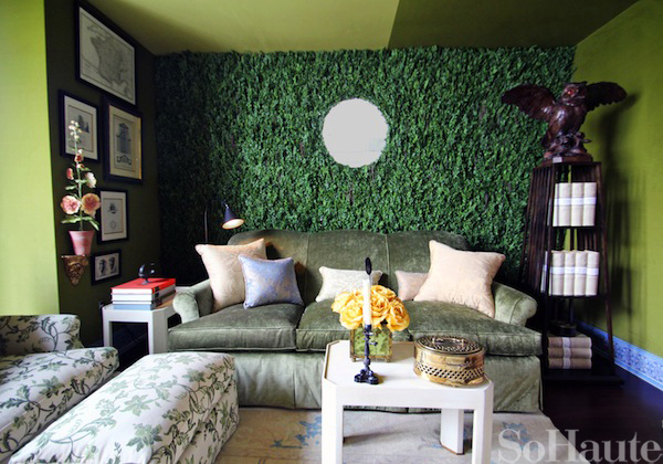
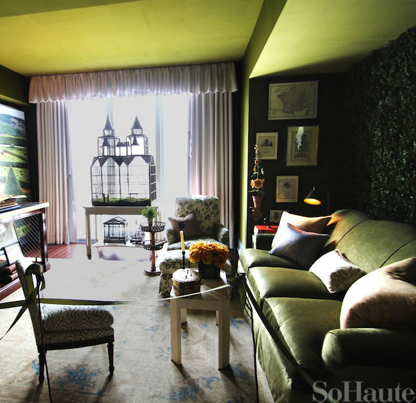
Conservatory by Charlotte Moss
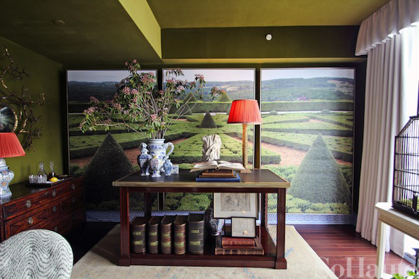
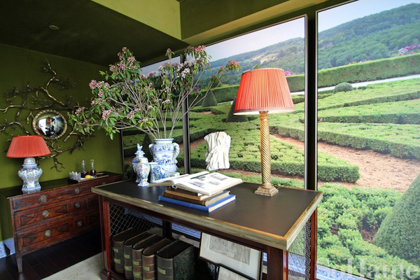
Last but not least is an entire master bedroom wing that design doyenne Charlotte Moss transformed into a conservatory. On the wall here is a giant photo that Charlotte took of a beautiful garden in France that she had blown up and framed as a triptych. The furnishings are all from Charlotte’s furniture collection for Century.
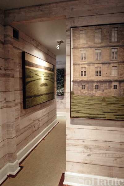
Charlotte used a trompe l’oeil effect throughout her space, for example, the “wood paneling” that you see on the walls here is actually a wallpaper from Sylvester & Co! The sisal carpet here is from Charlotte’s collection for Stark.
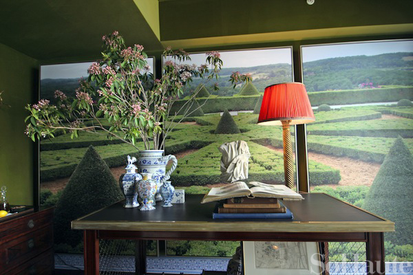
It’s tough to see in these photos but the baseboards are actually hand painted to look like Delft tiles…another trompe L’oeil effect in action. (Curbed has a great close-up shot here)
The wall behind the sofa is covered in dried boxwoods and the rest of the walls in a velvet fabric from Charlotte’s collection for Fabricut. All of the upholstery and window treatment fabrics are also from Charlotte’s collection.
Admittedly, this on isn’t the greatest photo but I wanted you to see the antique birdcage in front of the window because Charlotte told me this piece that inspired the entire room!
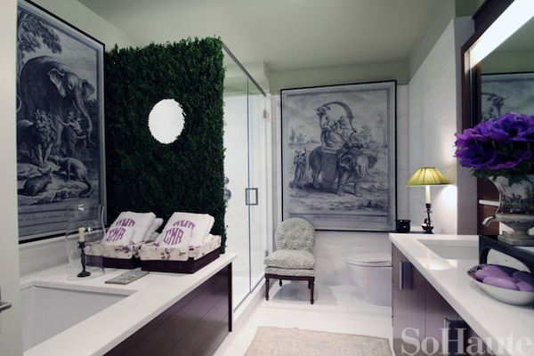
Here, a shot of the bathroom that is part of the master suite. Charlotte brought the conservatory feel in this space too with the addition of more boxwoods and the larg artwork rom Charlotte’s collection for Soicher Marin. The bath linens are from Leontine.
If you’re in the New York area, I’d highly recommend checking out the Kips Bay Showhouse. This years is arguably one of the best yet! The details are below! Stay tuned for part 2 of my Kips Bay coverage and I’ll be posting additional photos over the weekend on Instagram. (You can follow me @sohaute!)
KIPS BAY DECORATOR SHOW HOUSE INFO
Dates:
May 16th – June 14th
Hours:
Monday – Sat: 11 am – 5 pm; Tuesday & Thursday evenings until 8 pm; Sunday: noon – 5 pm
Location:
The Aldyn Residences
60 Riverside Blvd between 62nd & 63rd Streets
Tickets:
Tickets are $30 and can be purchased at the door or online here
More Info:
www.kipsbaydecoratorshowhouse.org





10 Comments
Wow! All the rooms are amazing! Especially love the kitchen! Thanks for sharing!
@Jill Glad you enjoyed it! And yes that kitchen is to die for!
OK, so your photos are 8 billion times better than the ones from curbed and the NYTImes that I posted yesterday. They pretty much made every room look horrific. You took a wider approach and more angles so you can definitely get a better sense of the space…
I can’t believe you like that hampton bedroom, it looks like a funeral parlor…But I do love the collectors bedroom and the room by Raji, both look sophisticated and sleek! Need to see it in person!
@sketch42 Thank you so much!! I’ve ben trying to brush up on my photography skills so I appreciate the compliment! LOL – re the Hampton bedroom! I guess I’m a bit more traditional. And – I owe you an email! Will shoot you a message now! And definitely go see Kips Bay in person. Totally worth it!
Every year I say I’m going to NY for Kip’s Bay and every freaking year something comes up and I can’t go. I think I need to actually make plans, buy my plane ticket, book the hotel room and actually go to see these wonderful rooms in person.
I love all the color in these rooms but I do love Alexa Hampton’s bedroom even thought it’s brown. The bed is beautiful. I’m not sure about that master suite turned into a conservatory. The birdcage is great but I don’t know about the boxwood walls. I’m not too much into kitchens since I don’t cook but that entryway with the leaping zebras is just so fun. Makes me smile.
Thanks for the photos and they are very nicely done.
Pingback: Kips Bay Decorator Show House | Ana Donohue Interiors | Specializes in residential and boutique design.
Pingback: A Peek at The Kips Bay Decorator Showhouse | Wainscot Solutions
Pingback: A Show House kitchen | Design Manifest
hat the master suite turned conservatory:(
hate