A while back I paid a visit to the office of decorator, antiquarian, design historian and author Thomas Jayne. Thomas is best known for his scholarly knowledge of design history, his expertise in historic preservation and his classical interior design work. (And at 6’7” he’s also known for being the tallest decorator in the biz!) With a background in architecture, art history and decorative arts, Thomas began his interior design career working with Albert Hadley and Sister Parish at the celebrated design firm Parish-Hadley. In 1990 he opened his own design studio and is now considered one of America’s most prominent decorators. Below are highlights from my conversation with Thomas Jayne as well as a peek inside his NYC office…
What sparked your interest in design?
I was always interested in decoration and when I was 12 I got paid to put up people’s Christmas decorations and help them with their houses and gardens. One day I was at my friends house sitting on these chairs and I told my friends mother that I was going to be a lawyer and she said “oh no you’re going to be a decorator!” Being a decorator in those days had a huge stigma and so I avoided it until I was 30 when I finally accepted the fact that it’s something I’m really good at. There were other things I knew I could do but I knew that I could be a really good decorator and that’s when Parish-Hadley offered me a job.
What were you doing before working at Parish Hadley?
I worked at a museum and I studied architecture and art history. If you read my resume it’s like a natural progression to being a decorator.
How did growing up in Los Angeles influence your style?
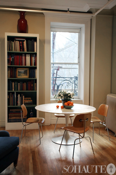
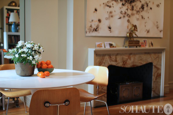
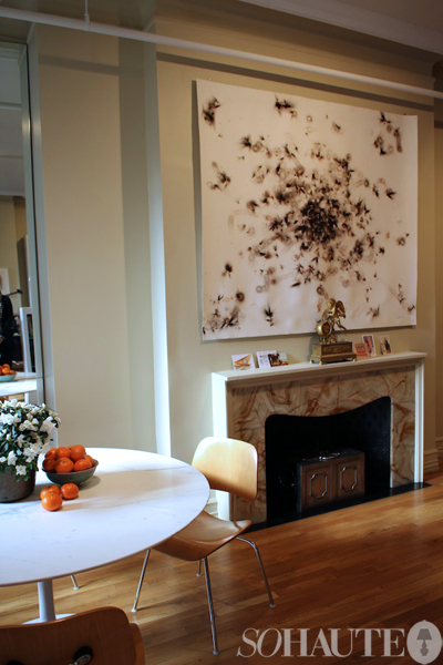
I grew up in the Pacific Palisades where my school, my church and my library were all designed by a great modernist architect named A. Quincy Jones. My first Eames chairs which are here [shown in photo above] were in my best friends house growing up…so I always had modern influences. What was interesting was that even the really modern houses in LA were full of antiques. And later in my career I met a stylist who styled for House and Garden in Los Angeles in the early 50s and if you look at the photos all of the modern looking props were the same because that was what was in the back of her car! They were really trying to push that modernist idiom when they photographed things and they pushed anything antique out of the picture because they wanted to be new and fresh, but in fact many of these houses very often were a combination of old and new. I was always around a lot of old things mixed in with modern architecture so old and new has really become my major focus. And in fact when my first apartment was published these chairs [the Eames chairs] were right in the middle of an antique desk!
How would you define your aesthetic?
People consider us as being traditional but I think the reason we’ve had success is because our work is always contemporary but not modern. We try to recolor and reshape tradition so it appears to be of our generation and fresh. Our catchphrase is that we’re both ancient and modern. I also think that when you push the boundary of traditional in a house it makes it very enduring. I decorated a house in Southampton – the Westerly estate – and Tory Burch bought it and she kept most of the decoration. Anytime a tastemaker like that can decide a lot of its livable 15 or 20 years after I did it is pretty good.
What are some of the great lessons you learned from Albert Hadley?
I learned that (as a decorator) you have to go everywhere and look at everything. He was one of the big promoters of the idea that everybody has something good. Nowadays there are a lot of great resources online but I still like to shopping and see all the dealers in person. I see all the great stuff that just came in that you won’t find online. Also, not everything Albert did was successful. He didn’t always get it right first time but each time he adapted and changed and that’s what made him great.
Your book, The Finest Rooms in America, has been incredibly successful. What do you think makes a room “fine”?
I define fine room as a room that has an object of focus and thought around it. And the basic tenet of the book is the idea that anyone can have a fine room if they take the time to focus on what they want to look at and how they want to arrange the room… Even if it’s a college student with their favorite poster. I wanted it to be a very democratic and encouraging book I want people to read the book and have the feeling at the end that ‘I can do that too.’ Obviously a lot of the rooms I show belong to people who are very rich but at the end of the day everybody has the same concerns and wants a room to evoke similar feelings.
Tell me about your office space…
This Eastern light and being able to see the trees is a pretty great asset. One things about our office is that its very collegial and we share everything which I like. And being in this space kind of feels like being in rental apartment and all the objects in here have a story and a connection.
What are some of the elements of your creative workspace that keep you inspired?
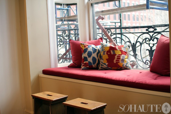
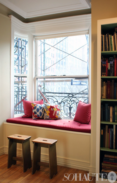
Sitting on that bench and looking out at Madison Square and the Flatiron building is pretty great. And sometimes I look at books and brainstorm but mostly we pick up our ideas away from the office. Here it’s more about production than inspiration and we get more inspiration when we leave. I travel quite a bit and take advantage of all of the opportunities in New York. I go to London on a pretty regular basis and my colleagues there are really inspirational. I’ve also been spending a loot of time visiting my friends in LA from school and they all really creative and interesting.
Every time I see you, you always look so dapper! And I don’t think I’ve ever seen you not wear a bowtie! Has that become your signature?
Ha! I wear a long tie every 10 days just so people don’t think I’m predictable!
See more of Thomas Jayne’s office below!
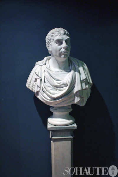
A 19th century George IV bust sits at the entry to Jayne’s office. “I never imagined I’d have had a bust of George IV in my hall,” he says. “But it looks good.”
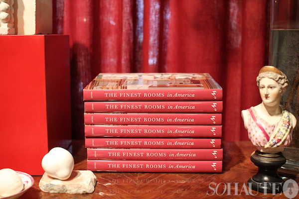
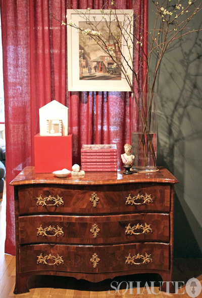
A chest of drawers made in Dresden, Germany in the 1730s. On top sits stacks of Jayne’s book, The Finest Rooms in America, along with a small 19th century bust of Diana made by Meissen. The watercolor above the chest was done by Walter Montgomery in 1942 and depicts downtown Los Angeles.
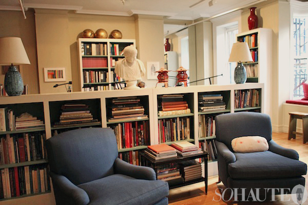
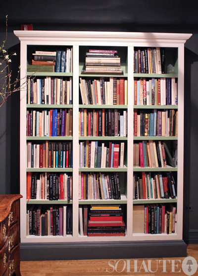
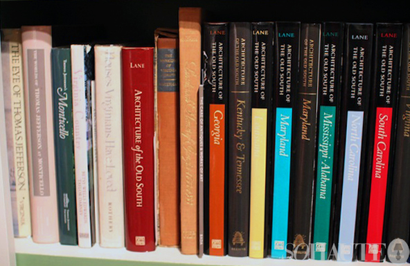
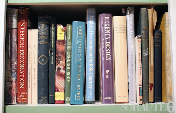
Here, one of several bookcases in the space that holds part of Jayne’s extensive library dedicated to architecture and the allied arts. “The bookcases came from our old office and we adapted them to fit this space when we moved”, Jayne says. “They help give the space architecture.”
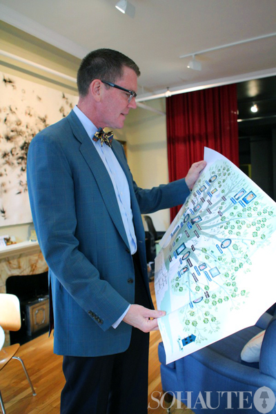
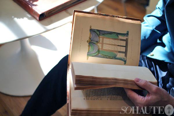
Here, Jayne flips through one of his favorite books in his collection, George Smith’s Cabinet and Upholster’s Guide, London 1826.
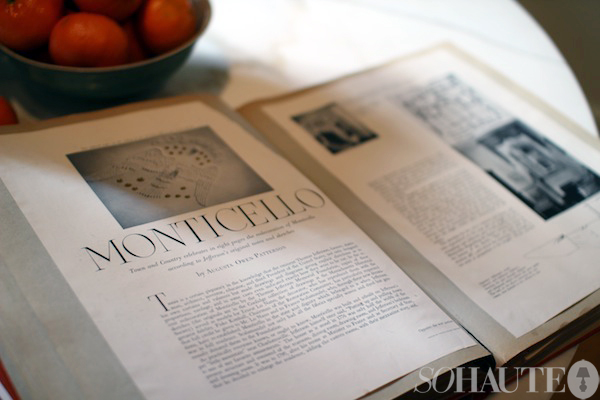
Another one of Jayne’s favorite books is this scrapbook devoted to decoration from the 60s and 70s that was given to him by Cora Ginsburg.
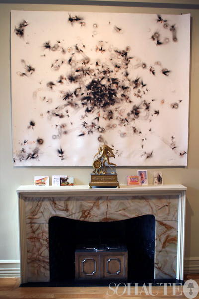
The large work of art over the fireplace is by David Sena who works as a tattoo artist and a multimedia artist. He’s known for his works like this one, that are drawn with fire. “I really wanted something modern here and I like the organic quality of this piece,” says Jayne.
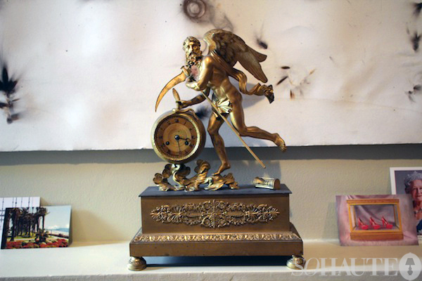
Jayne’s favorite decorative object in his office is this French clock from the 1830s which depicts the Father of Time and the idea that time flies. “It’s really interesting and I love things that are related to time,” he says. Fun fact: Jayne once dressed as the Father of Time for Mardi Gras in New Orleans where he and his partner, Rick, have a second home. They couple celebrates and dresses up for Mardi Gras every year.
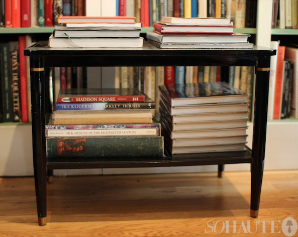
This two tiered table is by Jensen and was from the Duchess of Windsor auction. “I put in low bids for several things and got this for a phenomenal price.”
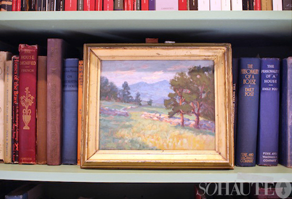
An oil painting of California from the early 20th century reminds Jayne of home.
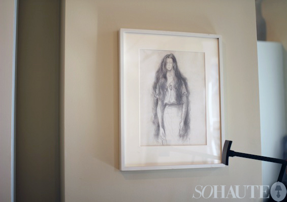
A drawing of Jayne’s mother by Philip Guston.
Click here to visit Thomas Jayne’s website and here to order a copy of his best-selling book, The Finest Rooms in America.
Photos by Nicole Gibbons





Comments are closed.