Photo: Simon Upton/New York Magazine
A growing trend in Manhattan real estate is for developers to hire A-List interior designers to transform model residences in condo buildings in order to drum up buzz and help sway potential buyers by allowing them to envision what their future home could look like. Such is the case with Manhattan House – a landmark luxury condo development on the Upper East Side which features three beautiful model apartments decorated by Rita Konig, Celerie Kemble and James Huniford which are part of the building’s “Modern Collection” residences. The three sprawling apartments are equally fabulous but it’s Rita Konig’s space that really speaks to my sensibilities so will kick off this house tour trifecta with a look at her space…
The Modern Penthouse by Rita Konig
Photo: Simon Upton/New York Magazine
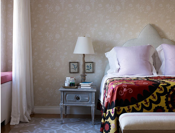
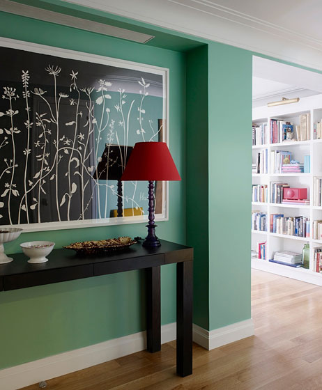
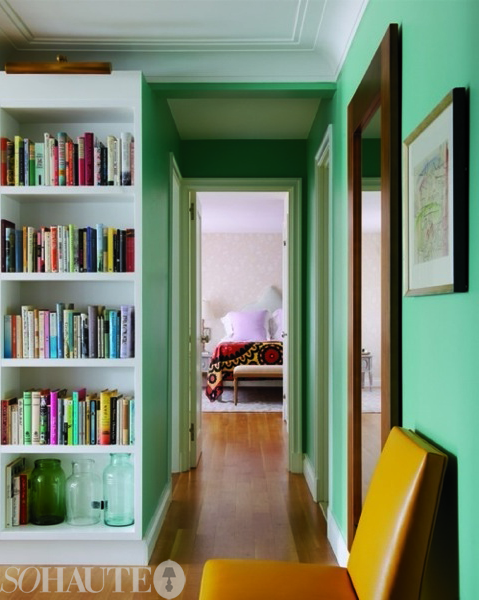
Rita Konig is the incredibly stylish former domino magazine editor whose quirky and unfussy design style is always a hit with the youthful, domino-loving generation of design devotees. She was given the task of decorating this sunny, 1,151-square foot, one-bedroom 1.5 bath corner penthouse that also has an enviable wraparound terrace with sweeping views of the New York City skyline. The casual sophistication and breezy colors of the space struck me immediately…I could easily move in and feel right at home. The bedroom shown above has subtle ethnic influences with its Moroccan inspired headboard and vintage suzani that really capture’s the eye’s attention. The entry, also above, features a bright green wall color with a large Hugo Guinness floral painting above a modern parsons table.
Photo: Simon Upton/New York Magazine
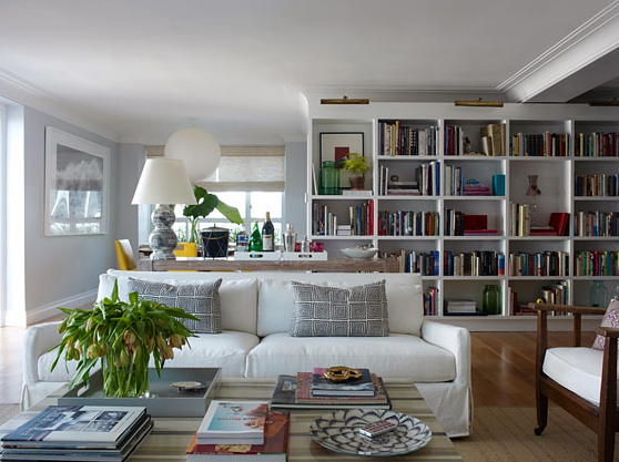
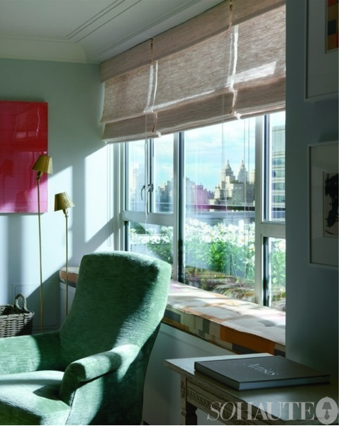
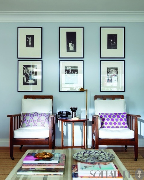
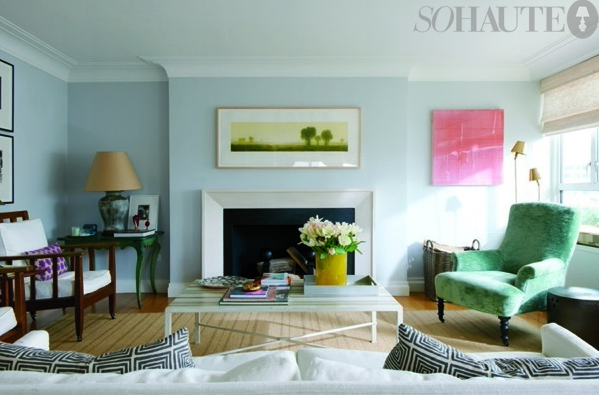
The living room has such a layered, lived in feel to it which to me evokes a sense of warmth and comfort. Another decorative feature I love are the stacks of books impeccably styled on floor-to-ceiling bookshelves and on the coffee table. An eclectic mix of understated furnishings, arranged for conversation, includes vintage and antique pieces from London and New York, textiles from India and lust-worthy artwork borrowed from the Sears Peyton Gallery. Many of objects seen here and throughout the apartment are Rita’s own, collected from her travels, and the library of books was assembled with help from Lorin Stein of the Paris Review. A few more photos of the living space are below. I also really love the window seat which provides an amazing amount of additional seating for entertaining.
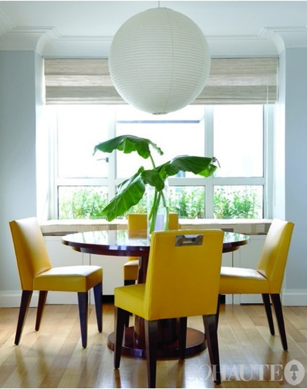
Here in the dining room is a Philippe Hurel table and chairs which belong to Konig and above hangs with a timeless, oversized Noguchi pendant.
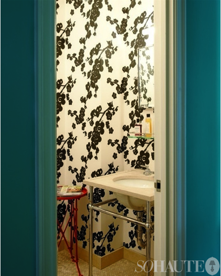
I really love the bold black and white floral wallpaper from Studio Four seen here.
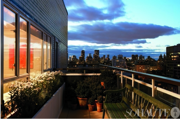
Perhaps the apartment’s most coveted feature is this lovely little terrace that wraps around the apartment, decorated with a quaint wooden bench and teracotta planters filled with greenery.
The Moderne9 by James Huniford
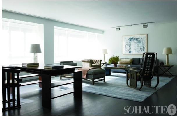
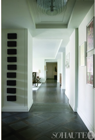
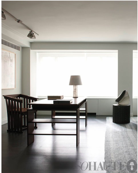
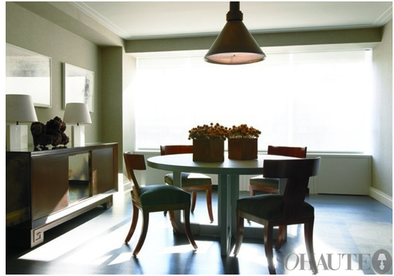
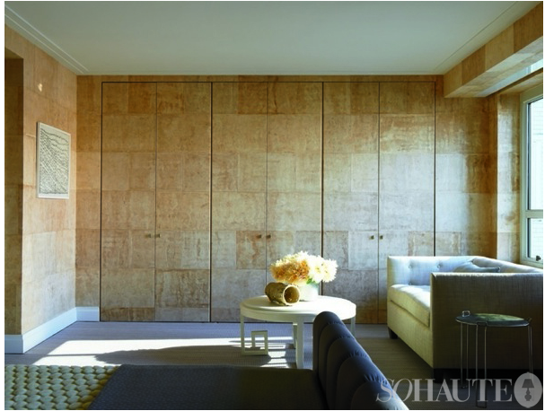
Interior designer James Huniford designed an urban oasis for his three-bedroom, three-bath 3,351-square-foot model apartment at Manhattan House which is an homage to famed architect Gordon Bunshaft who designed the building in 1950. The space feels incredible calming with a neutral color palette and modern, tailored furnishings that invoke a sense of refined simplicity.
Much of the furniture in the space was designed by Huniford. I really love the subtle contrasts of textures used here – from bark wall covering, patterned hardwoods and nickel hardware to upholstered pieces covered in linen, distressed leather, horse hair and alpaca. I also love the selection of modern, abstract art which was sourced through Creative Growth – a California based organization and gallery that champions the the work of artists living with disabilities. This airy, serene space is truly a picture of luxury and elegance.
The Modern Manhattan by Celerie Kemble
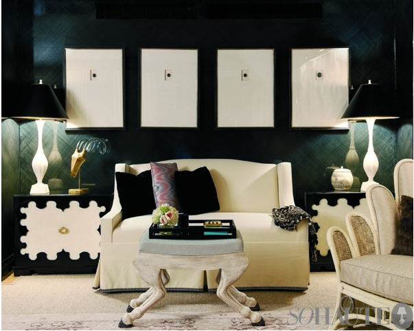
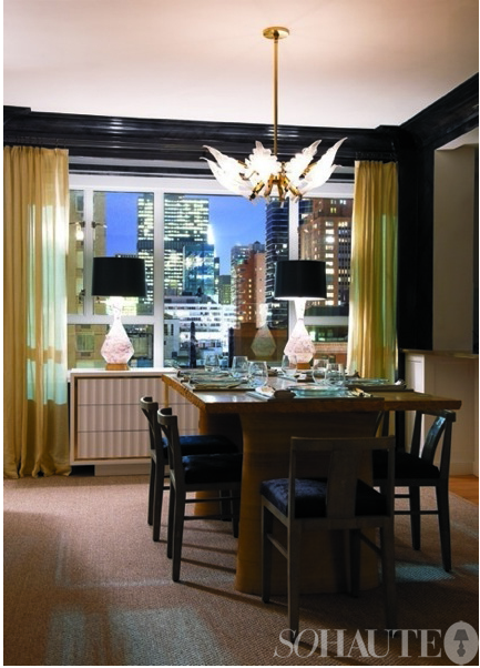
Glamorous, and a whimsical are two words that define the signature style of designer Celerie Kemble and it’s obvious the Manhattan House model apartment she designed has no shortage of either. The 1,861-square-foot, floor-through residence has three-bedrooms, three-baths.
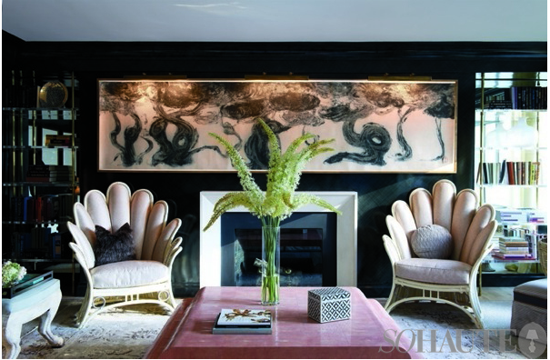
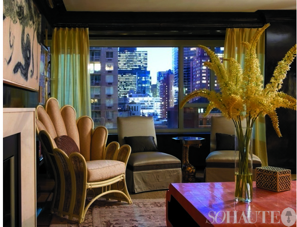
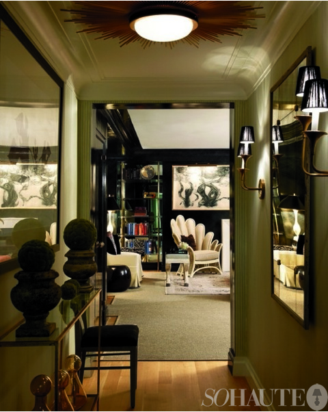
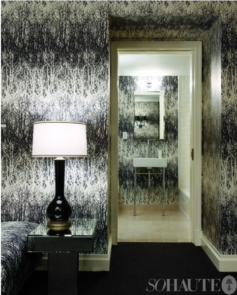
The space is filled with vintage textiles and eclectic 1960s furniture like these uniquely shaped rattan chairs that were likely a find from Kemble’s hometown of Palm Beach where she shops often. The chairs are the piéce de résistance in this swanky space that features a dramatic black lacquered strié on the walls, floating mirrors and lucite bookcases flanking a wood burning fireplace. The glossy black walls contrast nicely with the color palette of smoky grays, cream and soft blush pinks.
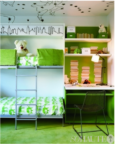
Even the childrens’ room gets a stylish touch with vibrant apple green accents and hand painted done by Alpha Workshops on the upper walls and ceiling. The fun bunk beds, designed by Kemble, fold up to reveal a chalkboard on the underside…fun an chic! When can I move in?!
All photos by Jason Schmidt unless otherwise noted.




17 Comments
NONE OF THE PHOTOS ARE SHOWING UP FOR ME!!!!! I get the first three photos and nothing else. I’m going crazy here!!!
Hi Essie! Thanks for your note! I’m trying to figure out the problem because I can see the photos just fine! I will work on getting whatever the issue is fixed asap!
These spaces should drum up sales for sure! I think Celerie Kemble’s is my favorite.
All very beautiful spaces, though I’m truly crazy over the wallpaper Celerie used in the bedroom!
Love various aspects of all three spaces. Even the stuff I don’t like, I like.
can’t see the photos either!
I also cant see the photos… I looked at this building a few years ago when I was apt hunting. At that time they had model apts done by Campion Platt, Jamie Drake and Alexa Hampton. They were so gorgeous!
They also had a Kips Bay Showhouse there one year.
They converted over from rentals to condo and it has not been an easy transition… Plus they have almost 600 apts in this building! So I guess they pull out all the stops when it comes to marketing!
OK Ladies – I think I fixed the image issue…hopefully everyone will be able to see all the photos now! Sorry for the inconvenience!
Thanks Nicole. I can see it all now and it was worth the wait!! I really love these designs. I think my favorite is Rita Konig. Her rooms are closer to my style. I love the color and patterns. In her bedroom photo I at first thought that side table was too small but the more I look at it the better I like it. Very pretty. And that wallpaper is lovely. I also like the other designers. Thanks for the pictures, Nicole.
Is it strange that I would like to the green Kemble kiddie room as my office/nap space?
Hi Nicole~Loved your post! I especially liked Rita Konig’s space.
I so miss her Domino Magazine editorials.
Jean
It is great to see different approach by each designer and you can see their vision clearly. Every space is unique and this is a great concept from marketing perspective. I think I want to do a spin on the artwork in Celerie’s living room in first image!
I love the green walls! I just can’t decide if it would work for me or not. It would have to be a perfect green like the one you’ve shown.
The space for the kids did for me, plus the view Goes to show that you can have serious style w/ children.
fabulous, all of them. especially rita konig- so eclectic, yet absolutely chic.
Very lovely. Curious about about the roman shade window treatments in the dining and living rooms. Do you know what the material or maker. Txs
Pingback: Celerie Kemble, we just