Photo: Michael Falco / NY Times
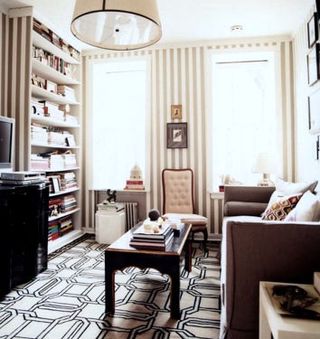
One of my favorite apartments from the now defunct Domino is the small but chic West Village apartment belonging to the magazine’s former decoration editor Tori Mellott. Her place wooed many-a-fans with its bold striped Farrow & Ball wall paper, glossy white floors, shutter-covered windows and perfectly curated wall of artwork.

Photo: Michael Falco/ NY Times
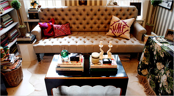
A few weeks ago, Tori’s place was featured in an an article in the New York Times about custom furniture. She was interviewed about her love for custom and the article highlighted her newer sofa shown above which was, of course, custom made. How beautiful! I LOVE those deep tufts, the rolled arms and English style legs. This dainty little sofa is perfection! Although the NYT article only gives us a small peek insider her living room, it’s fun to see how things have changed around since being featured in the Sept 08 issue of Domino. I actually like it better in its current incarnation. The new sofa is much more striking than the streamlined, slipcovered sofa shown in the magazine. The space also feels a little less propped and styled. Piles of magazines stacked under the sofa and in baskets along with books and objects stacked on her window sills make the space feel a bit more lived in and real. I also like that the sofa is now oriented in front of, rather than adjacent to the windows. Below is a look at her living room as featured in Domino last year. Which setup do you prefer? To read the NY Times article, click here.

Photo: Annie Schlecter / Domino

Photo: Annie Schlecter / Domino


10 Comments
I like both for different reasons. As you say, her current setup does feel much more lived-in and that couch is amazing. The before is much more polished. It’s very elegant and I love it too. *Sigh* I still miss Domino. 🙁
I think I liked the first set up better, but they are both gorgeous. I would love to see what that wall looks like without the couch on it…
Great article…Thanks!
I love seeing the changes Tori made to that small space. Thanks so much for sharing!
I love this apartment! It’s so much style packed into a petite space. I’m a fan of Tori and even decided to dedicate a “People Crush” blog post to her a few months back. – Judith
Tori’s room is beautiful floor texture. And the vertical striped prints on the wall are just clever idea. It made the entire room look elevated.
I like the fact that the room is full of books. It means that the people living on it are booklovers, has knowledge about certain things and are very well educated.
I love the changes! Especially the two new pillows on the couch!
the mixtures of textures and prints is just fabulous and bold….man, i need more space in my house.
BRI’S DESIGN LOVE FEST
Pingback: Dream, Daily: A Striped Salon | Live The Life You Dream About | A Style Interiors Fashion New York Life Blog