
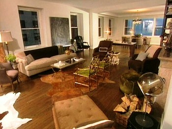
Here’s Nate’s living room from a May 2005 episode of Oprah. To the far left is a 19th century French bergere chair, and next to it sits a cozy linen sofa that Nate designed himself. A tablescape is artfully arranged on the French cocktail table and the bright green upholstered cushion on the faux bamboo chairs iprovides a tiny bit of color amongst a mostly neutral palette. Off to the right sits a Moroccan style pouf made of pony hair and in the foreground is a 1940s French chaise made of leather and corduroy. The two brown upholstered chairs at the far end of the living area are Mitchell Gold + Bob Williams. A limestone topped wood table acts as a divider between the living area and the dining area which is positioned at the very back of the room. Two complementary cowhide rugs cover the floors.
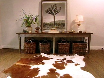
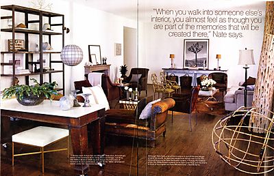
Here is Nate’s living room again…this time in the winter 2006 issue of O at Home magazine. Here, the Mitchell Gold chairs are positioned in front of the fireplace, the chaise is moved toward the middle of the room and in front of it sits a new brown suede armchair.

Here’s another photo from his O at Home story which features Nate and friends in his dining room. Notice the oil and burlap God Bless America painting by artist Remigo Gudin on the wall.
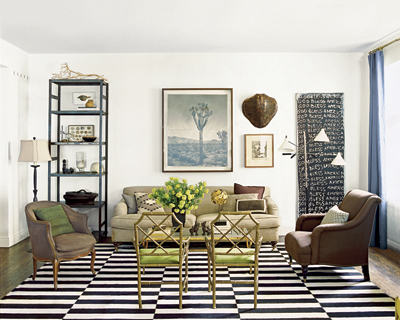
Here is Nate’s newly rearranged living room as featured on the cover of Elle Decor’s September issue. With the addition of a few stylish pieces to polish up the space, Nate simply rearranged his existing furniture to give his space a totally new look and the result is beautiful! The bold black and white Madeline Weinrib rug completely grounds the space. His linen sofa is repositioned on the wall where the French console once was. To the left of the sofa is an industrial looking steel shelving unit that was once positioned on a different wall in the room and to the right of the sofa is the God Bless America painting which once resided in his dining area. Behind the sofa is a different Joshua tree photograph by Bengoecha. In the newly created seating arrangement you can also see his Mitchell Gold chair, bergere chair, cocktail table and faux bamboo chairs from the previous photos.
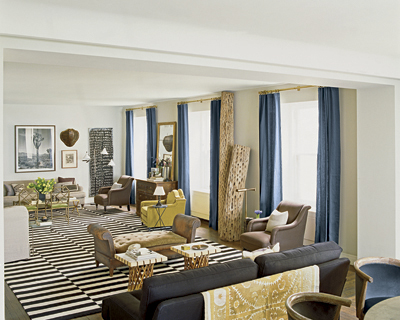
Here’s Nate’s “new” living room from a different perspective. Here you can see more of his existing furniture rearranged. There are also a few new additions including a black linen sofa with a suzani from Nate’s travels draped over it, a green upholstered armchair from Jayson Home & Garden and a distressed looking chest of drawers with an antiqued mirror sitting atop. Nate also dresses up his windows with blue linen curtains from Smith + Noble. The curtains and the new green chair infuse a welcome dose of color into his space that was primarily neutral before.
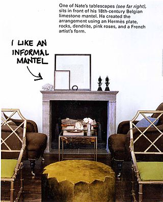
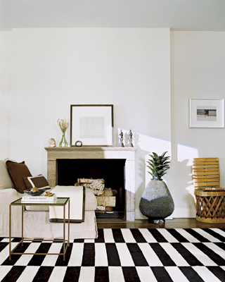
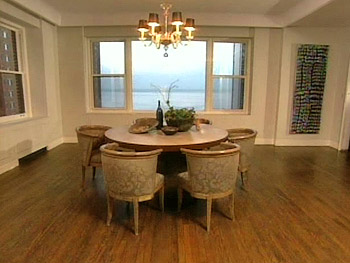
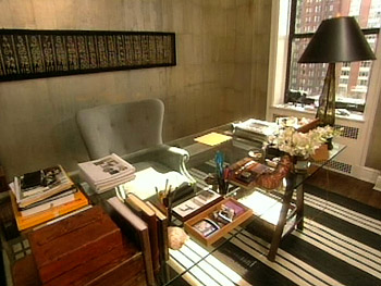
Here is Nate’s office before. His glass top sawhorse desk was custom made. The rug is from Ralph Lauren Home and the wall hanging is actually an old folk art game board.
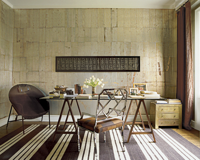
Here’s the “new “office. Nate’s additions include linen curtains, two new chairs and a small chest of drawers. The work chair is also reoriented so that Nate works facing the wall whereas before he faced the opposite direction.
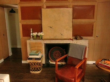
This is Nate’s library before the recent transformation. Here you can see the Mexican chair that now sits in front of his living room fireplace.
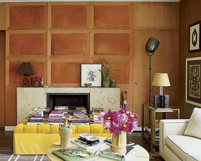
Here is the same area now. In front of the fireplace is a custom tufted ottoman upholstered in a bright yellow Clarence House velvet. The large painting was replaced with a smaller grouping of artwork and other decorative objects.
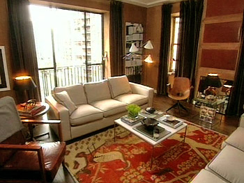
Here’s another shot of the library before. The two sofas were Nate’s custom designs.
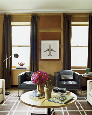
Here’s another photo of the updated library. A new round coffee table is positioned between the two sofas and against the adjacent wall are two beautiful black leather tufted armchairs that were once in Nate’s bedroom. The Hermes throw draped over one chair is a very chic addition. Could it be the influence of his fashionable boyfriend, shoe designer and Bally Creative Director Brian Atwood? Hmmm….
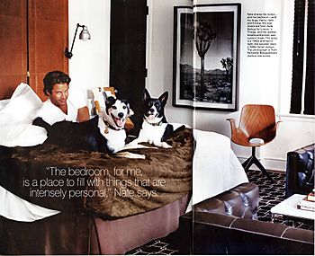
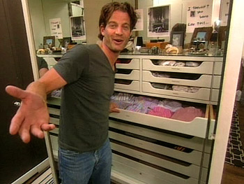
There’s nothing I love more than an organized closet and Nate’s is organized down to his color coded socks and boxers! The above photo is of his closet/dressing room before…
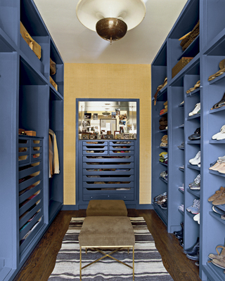
And this is what it looks like now. Nate updated his closet/dressing room with blue paint, grass cloth wallpaper and some stylish accessories.
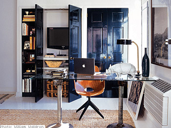
This is a photo of the office area in Nate’s New York apartment which he finished renovating last year. Behind the desk is the Fratelli Campana chair that was once in his bedroom at his Chicago apartment. Yet another example of how Nate ingeniously reuses and re-purposes the furnishings which he has collected over time. Nate did an amazing job at making his Chicago apartment look completely new by just adding a few new pieces and experimenting with new furniture arrangements. His space now looks polished and sophisticated and the infusion of color makes the entire place appear more bright and cheerful than ever. I give his apartment’s new look two thumbs up! What do you think?




7 Comments
what a comprehensive post!
It’s nice to track the evolution of his space.
Nate is just too adorable with his pooches
Great post! So fun to see before and afters.
-Lana
I also absolutely love Nate’s work and this post is excellent! The updated NYC appt. is so polished…Fay
I also absolutely love Nate’s work and this post is excellent! The updated NYC appt. is so polished…Fay
I also absolutely love Nate’s work and this post is excellent! The updated NYC appt. is so polished…Fay
i just love nate’s work…. everything nate touches turns to gold
Pingback: Dream Closets – Nake Berkus | The Posh Space